SmartCocoon
HVAC is a category that has never cared about how it looks or how it makes you feel. SmartCocoon asked us to change that. We rebuilt the brand from the inside out: a new identity system, packaging, voice, and visual world designed to bring warmth to a cold category.
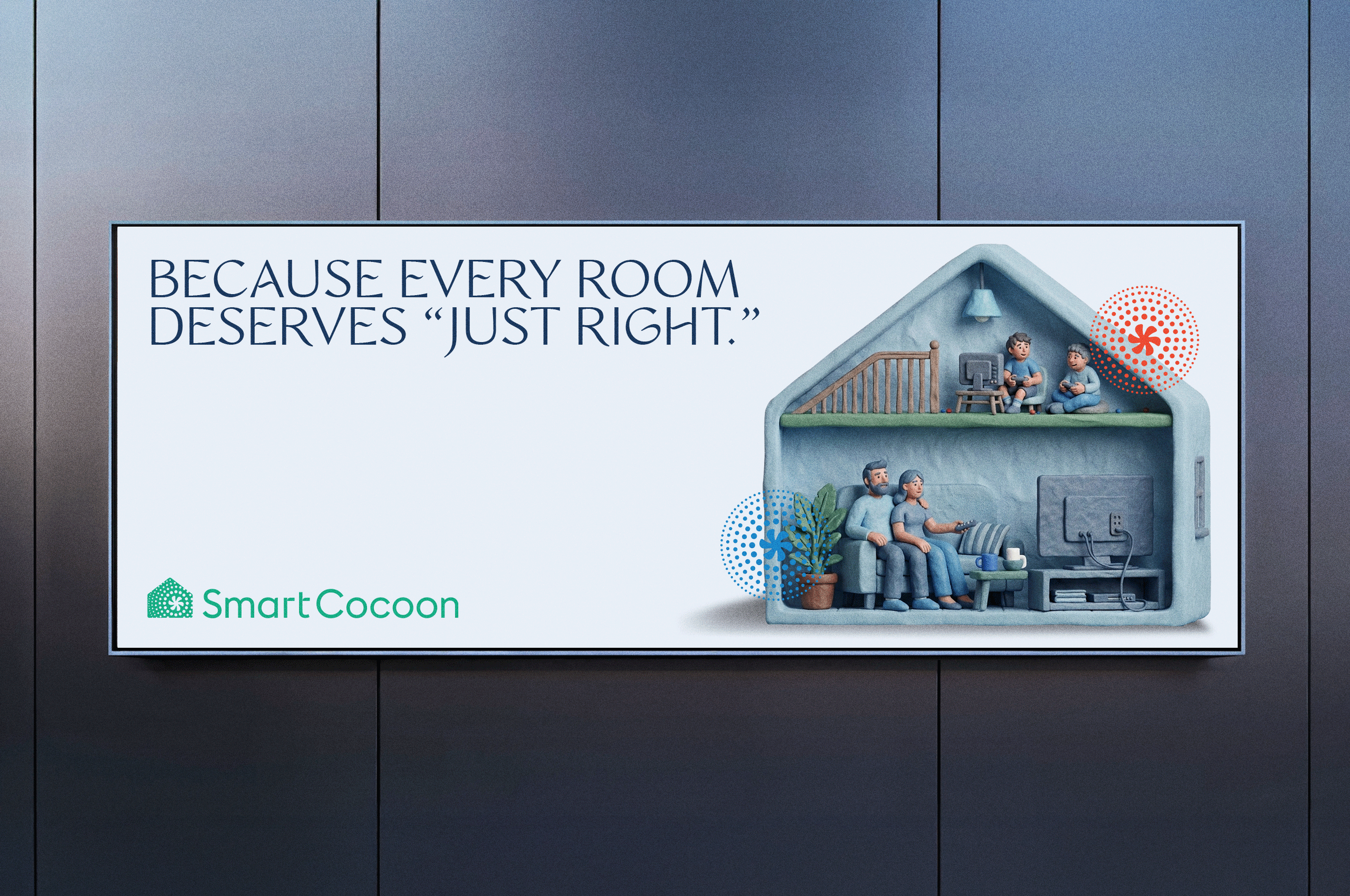
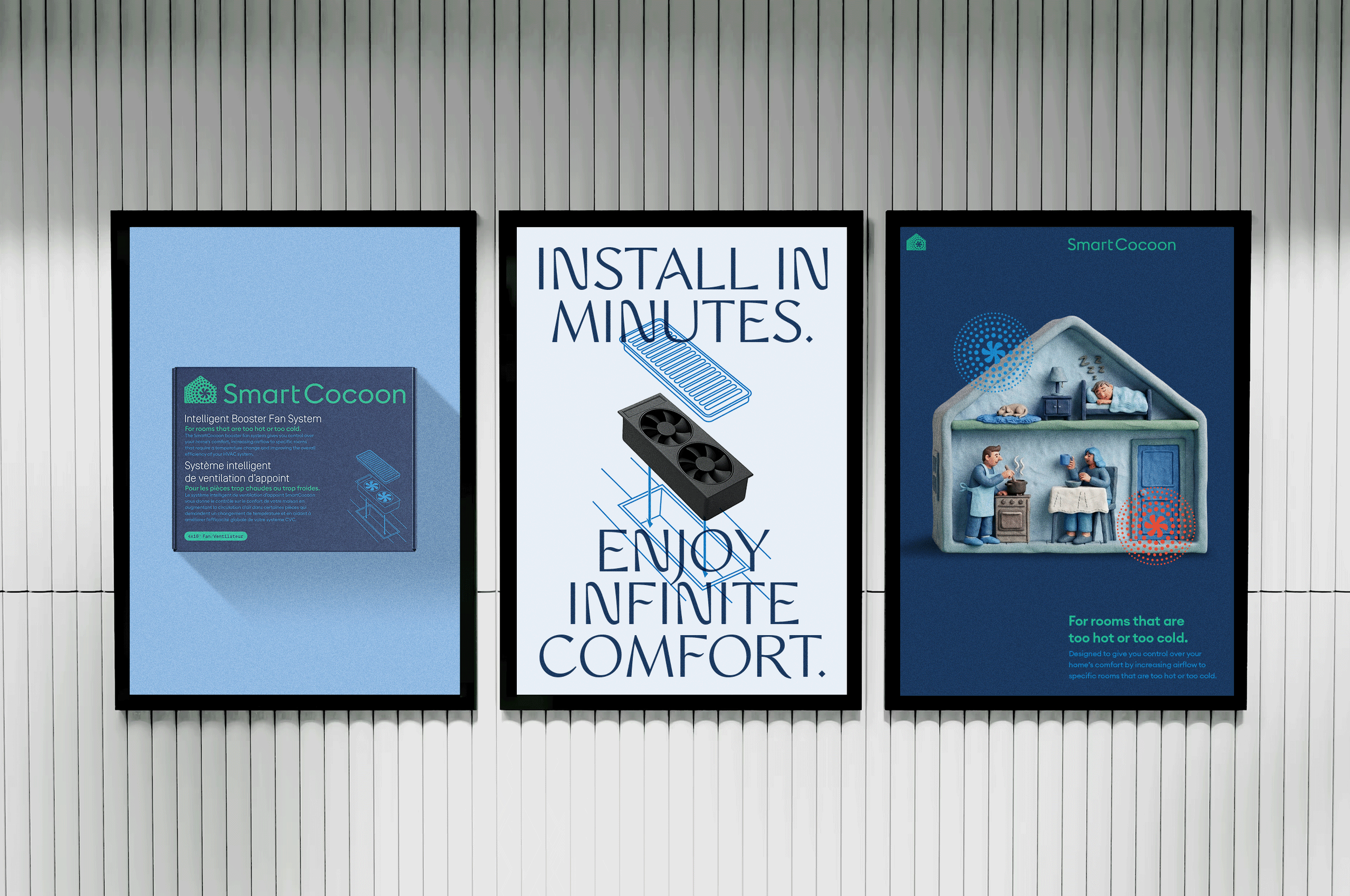
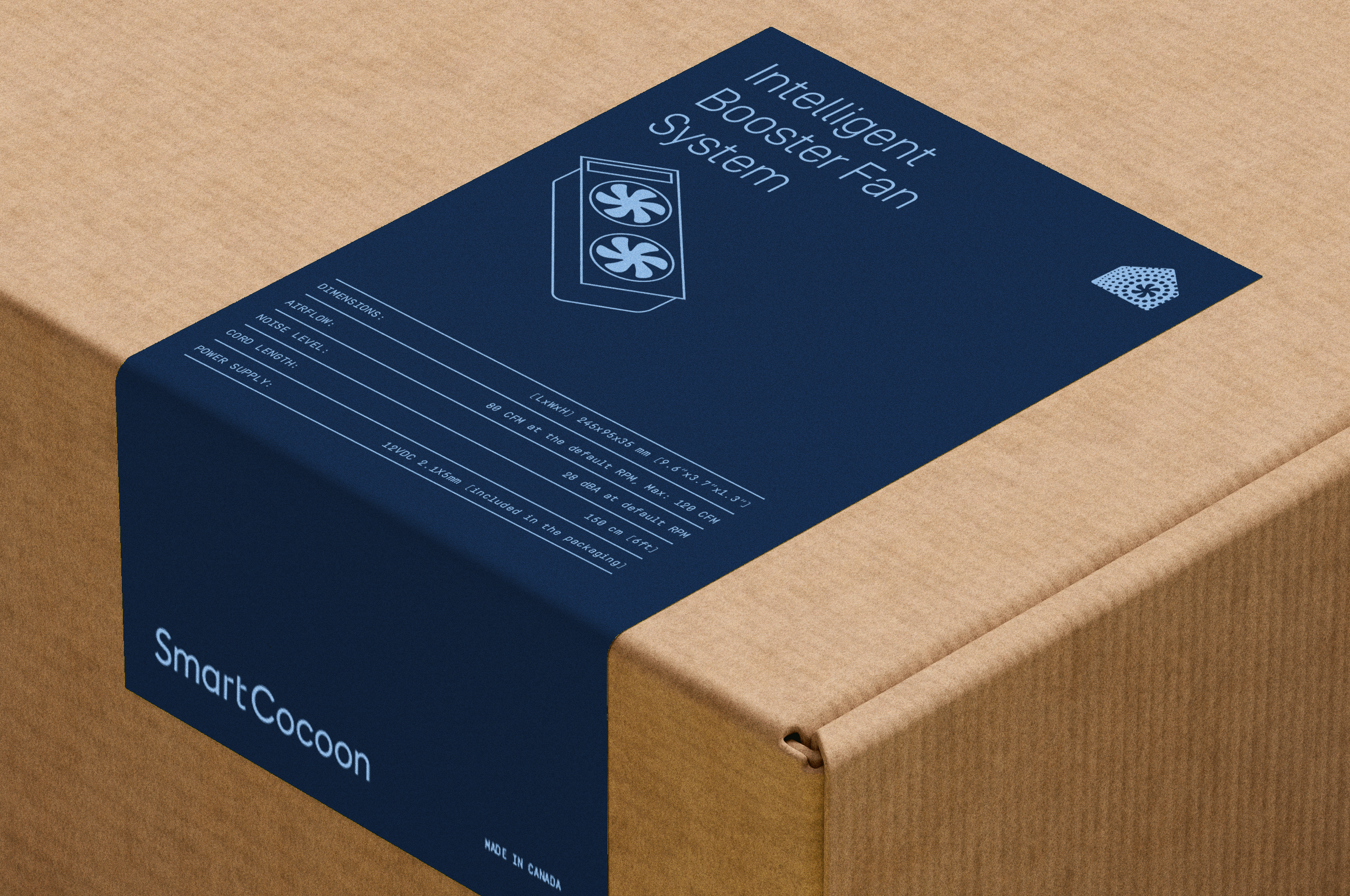
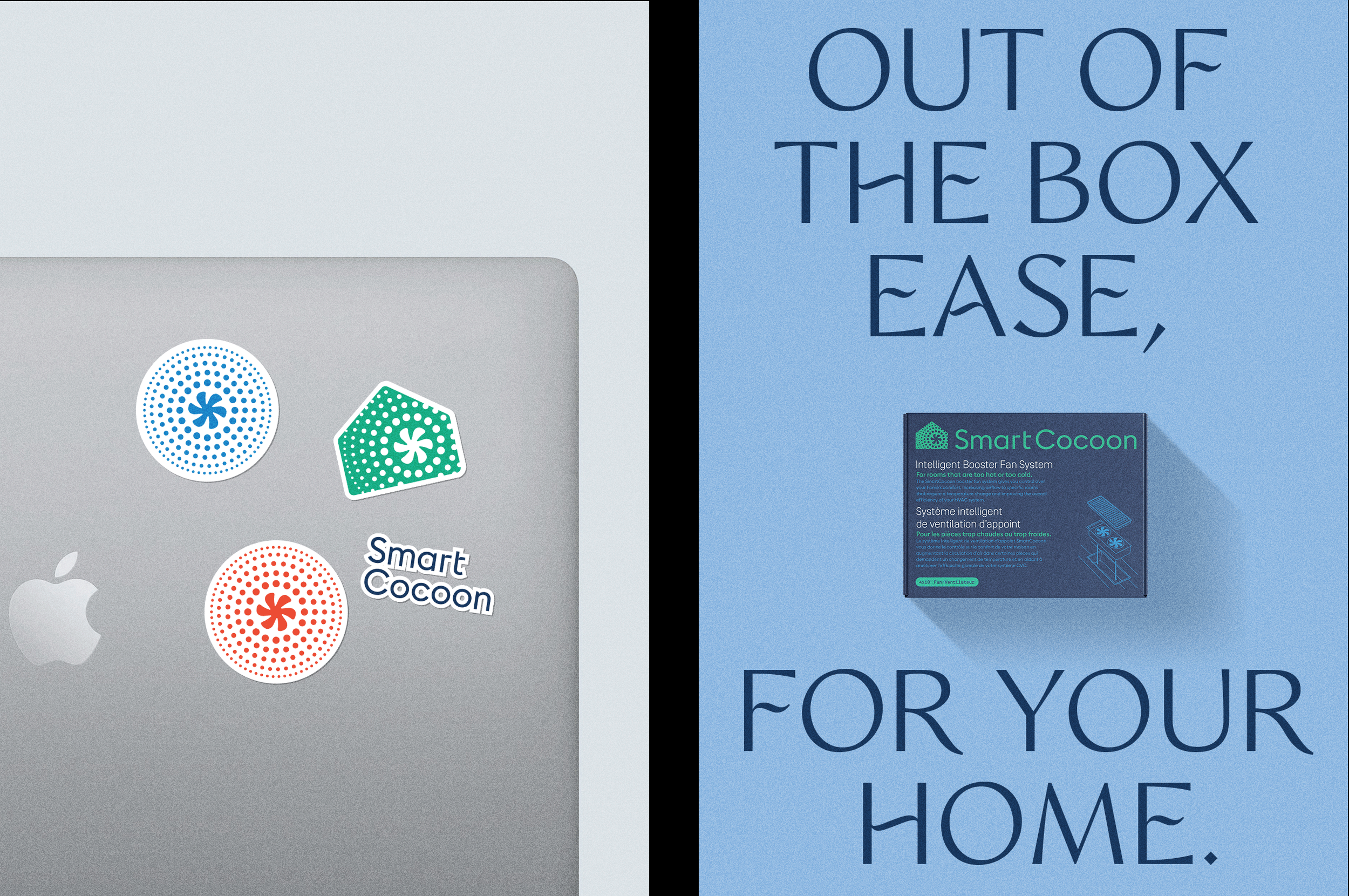
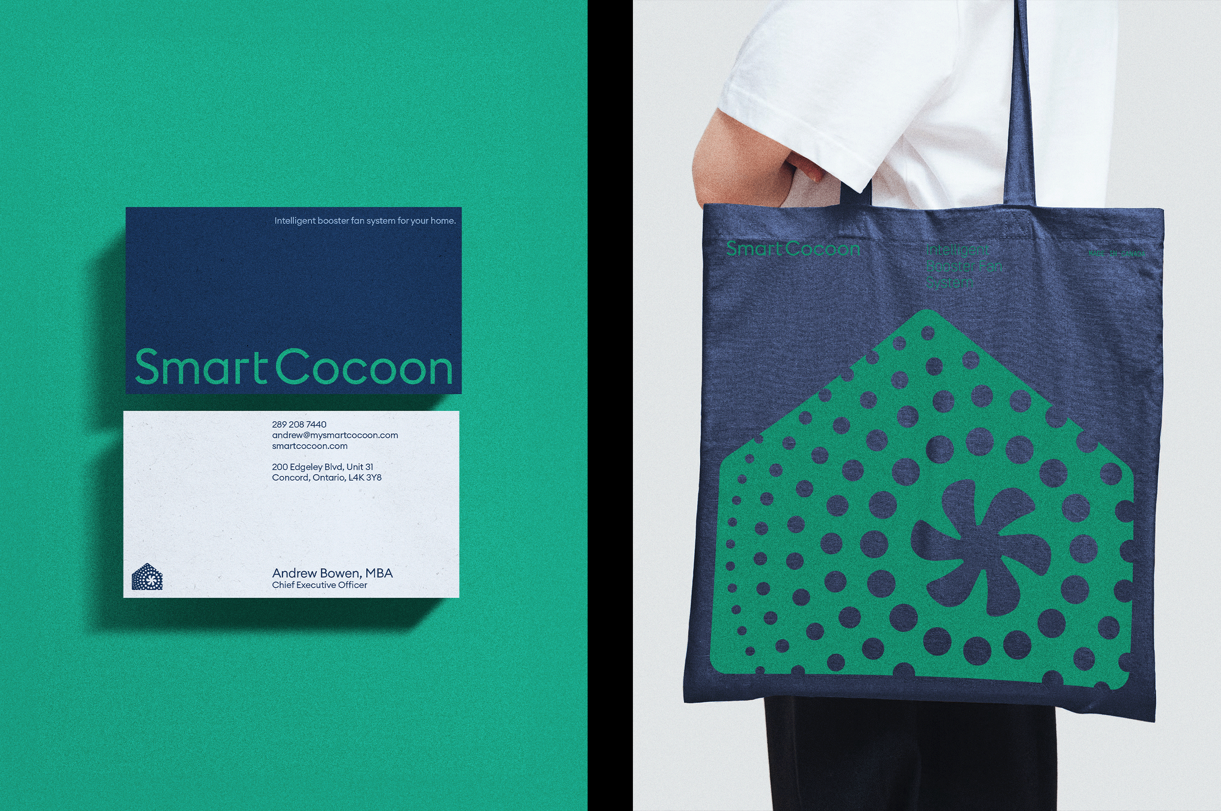
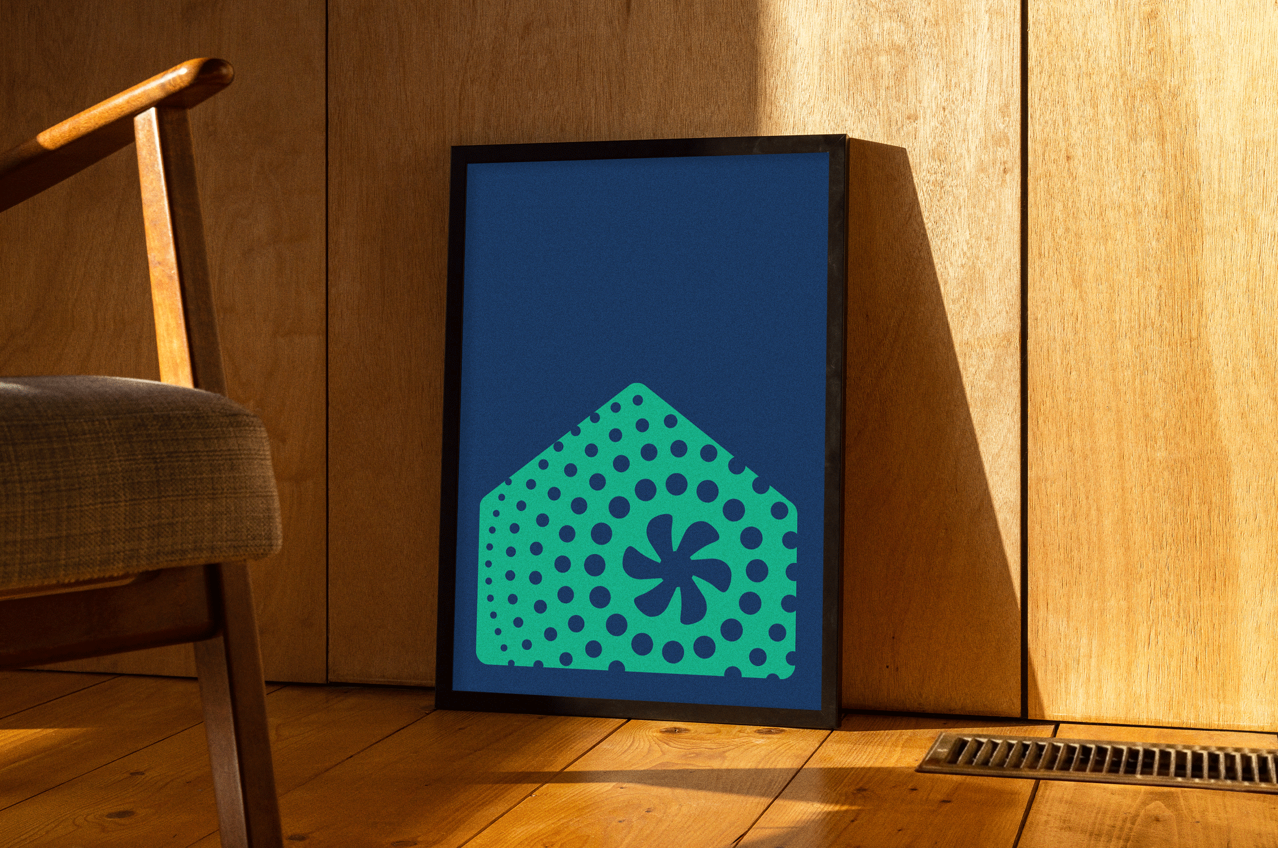
The icon says everything. The logo takes the shape of a home, and inside it lives the vent form drawn directly from the product itself, the heart of the house, with circles radiating outward mapping the range of temperatures the unit controls. Functional symbolism where the product logic is the brand logic.
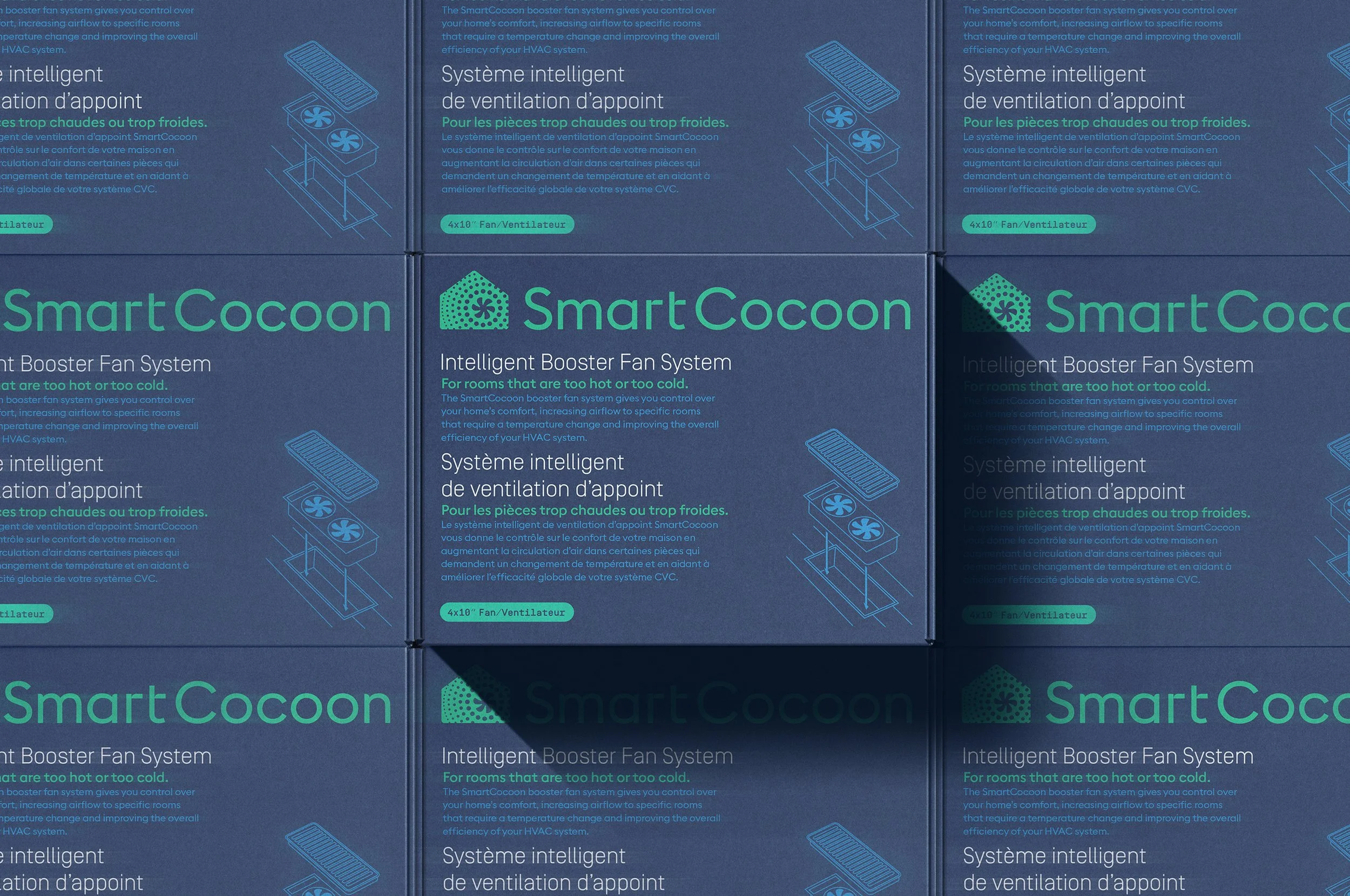
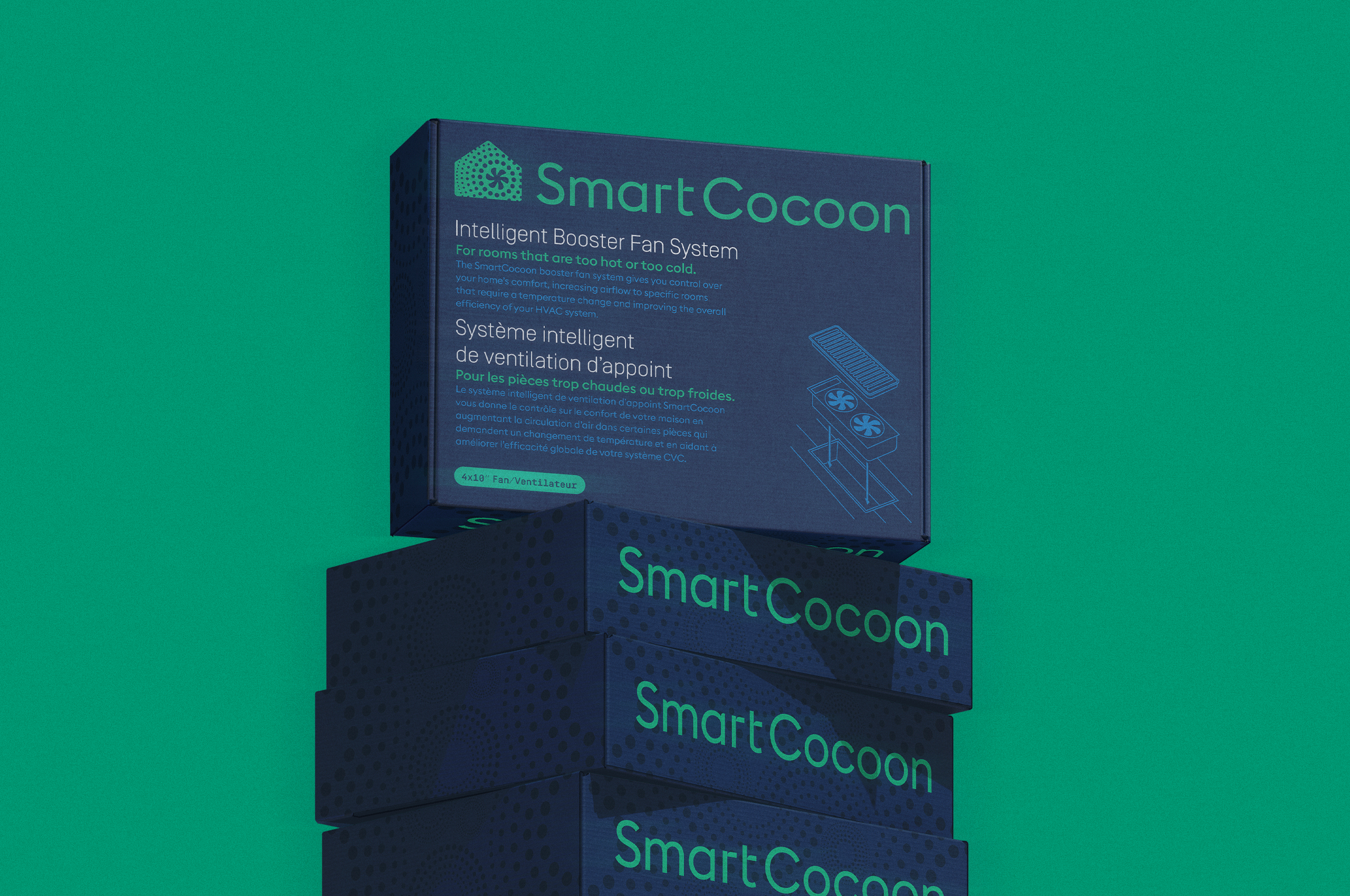
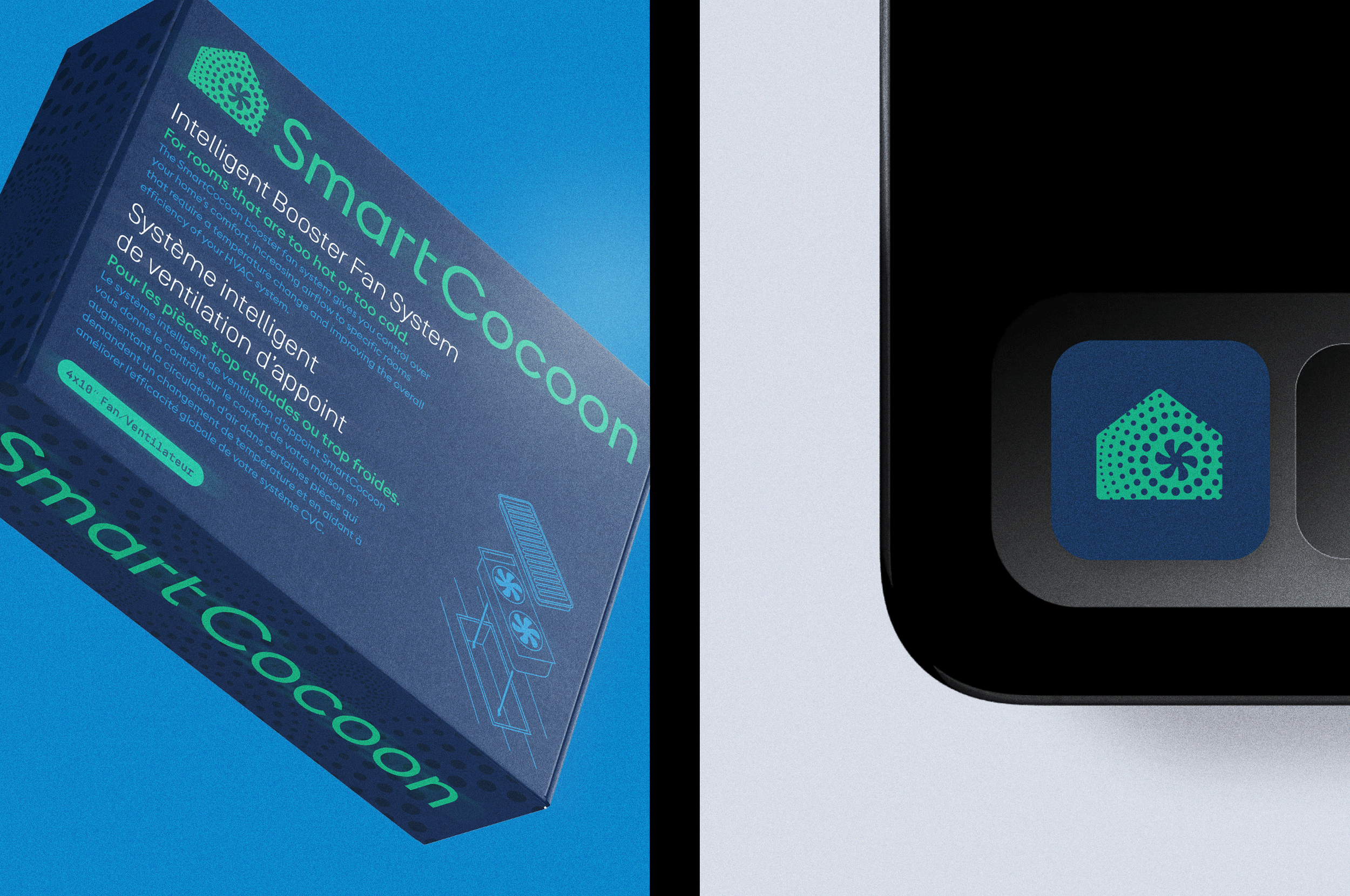
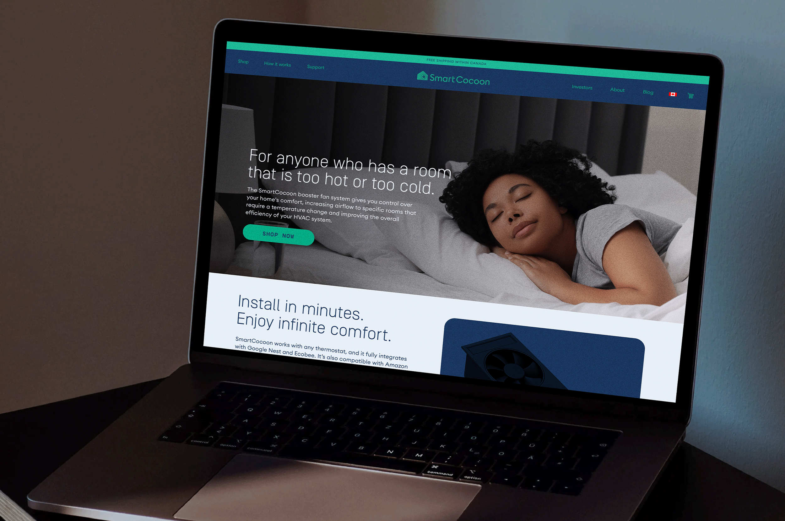
The palette breaks entirely from the HVAC norm of corporate blues, alarm reds, and industrial black. Fresh, residential, and considered, it jumps off the shelf against a sea of category sameness. Serif and mono typefaces are paired throughout: one inviting, one precise. Warmth and technology in the same breath.
The illustration system brings the brand to life through clay sculpted characters, tactile, human, and genuinely unexpected for the space. Where the category defaults to diagrams and stock photography, SmartCocoon offers personality.
Deliverables
Brand Identity
Packaging
Sector
Tools & Home Improvement