Liambas Hockey Development
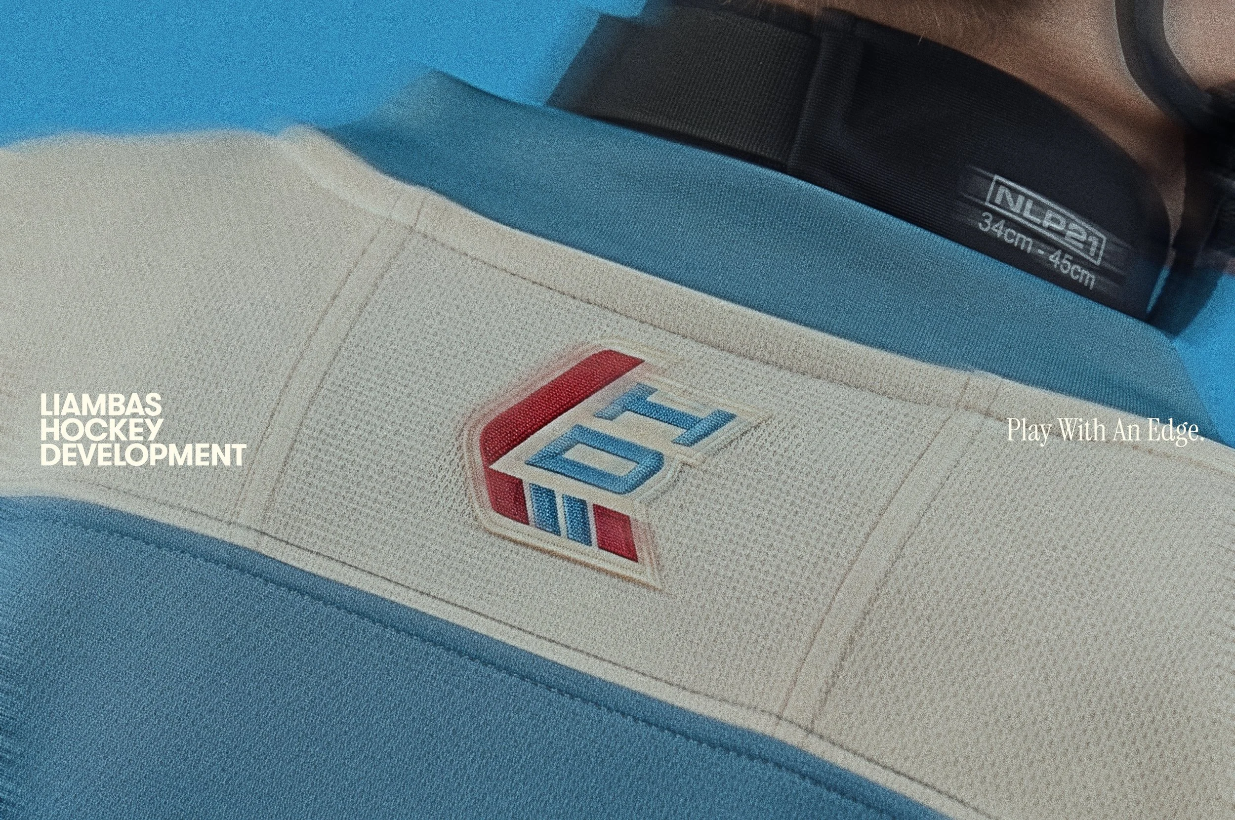
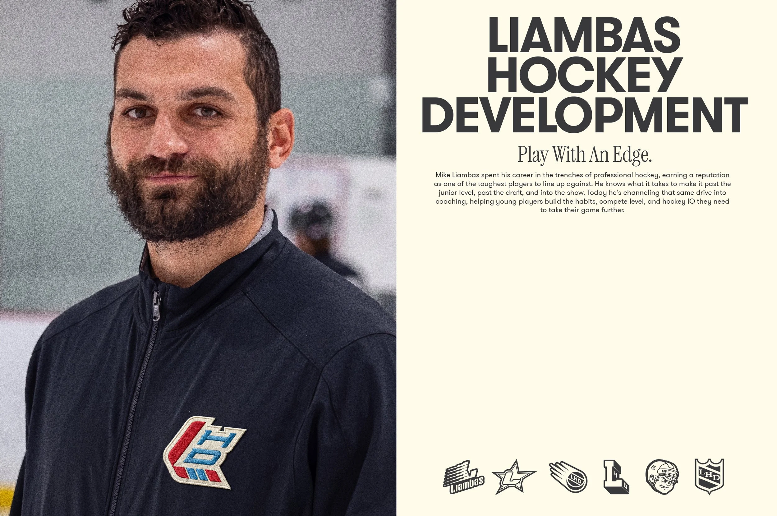
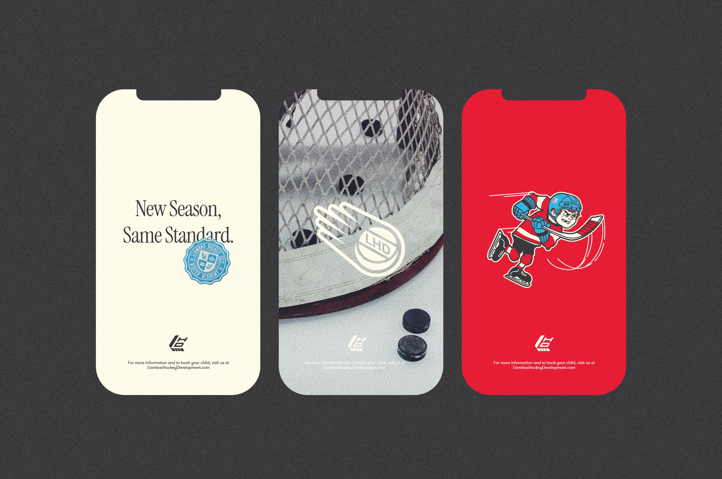
Hockey lives in two places at once: the future it's building and the past it can't shake. Mike Liambas spent his career in the trenches of professional hockey, physical, intentional, and completely uncompromising. The brand had to carry the same weight. Not a hockey school brand dressed up in generic graphics and motivational language. Something with integrity.
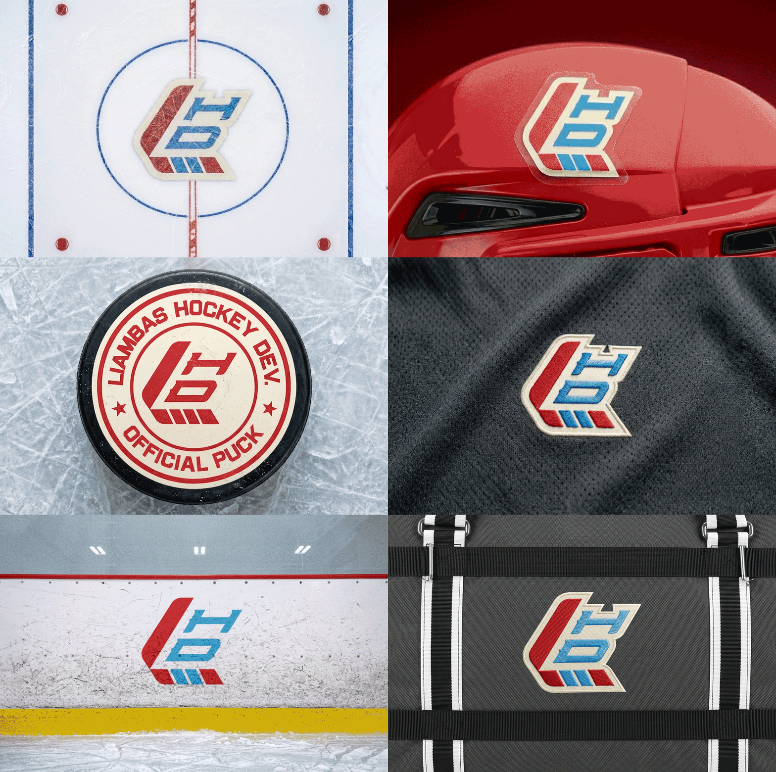
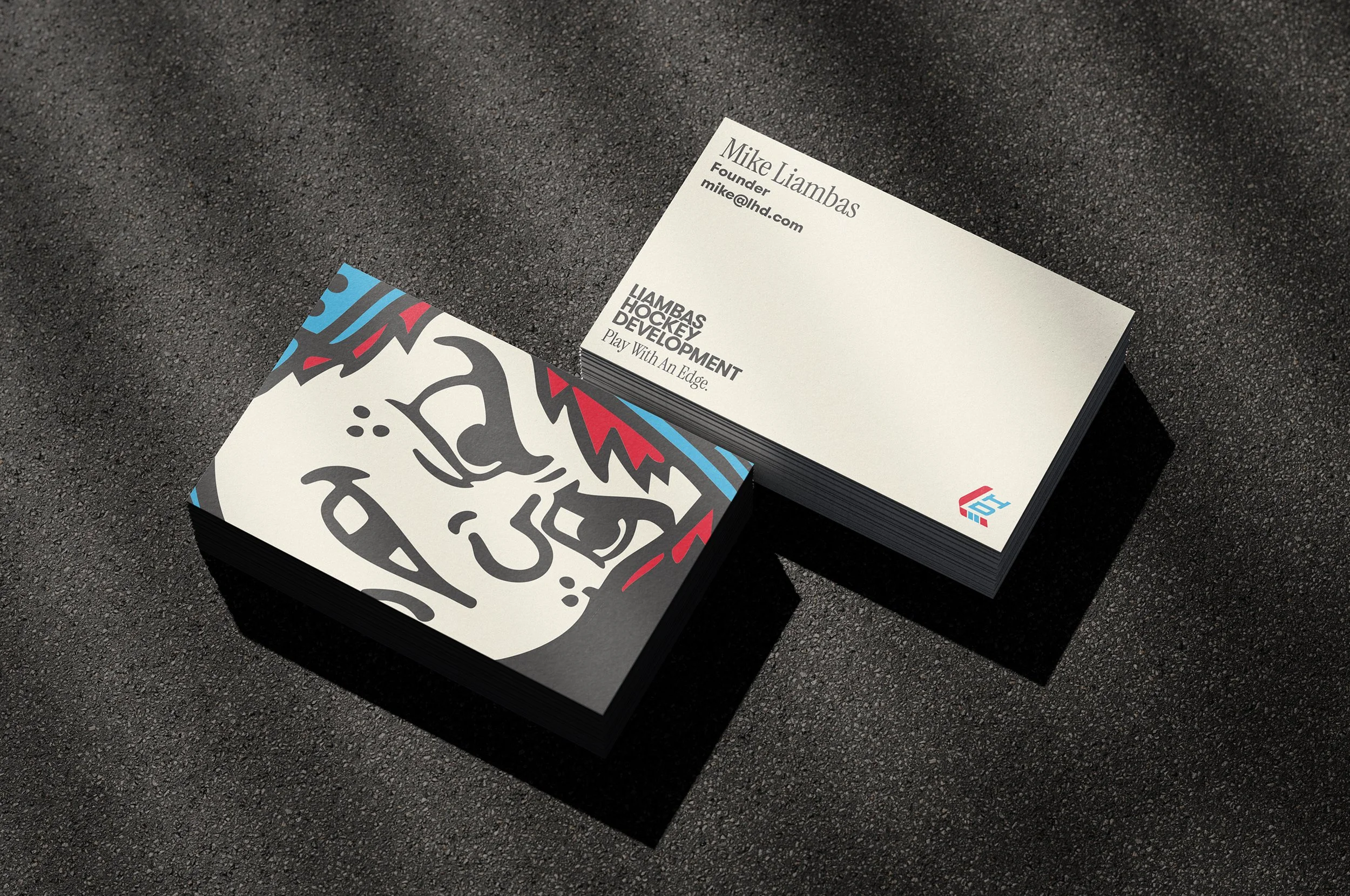
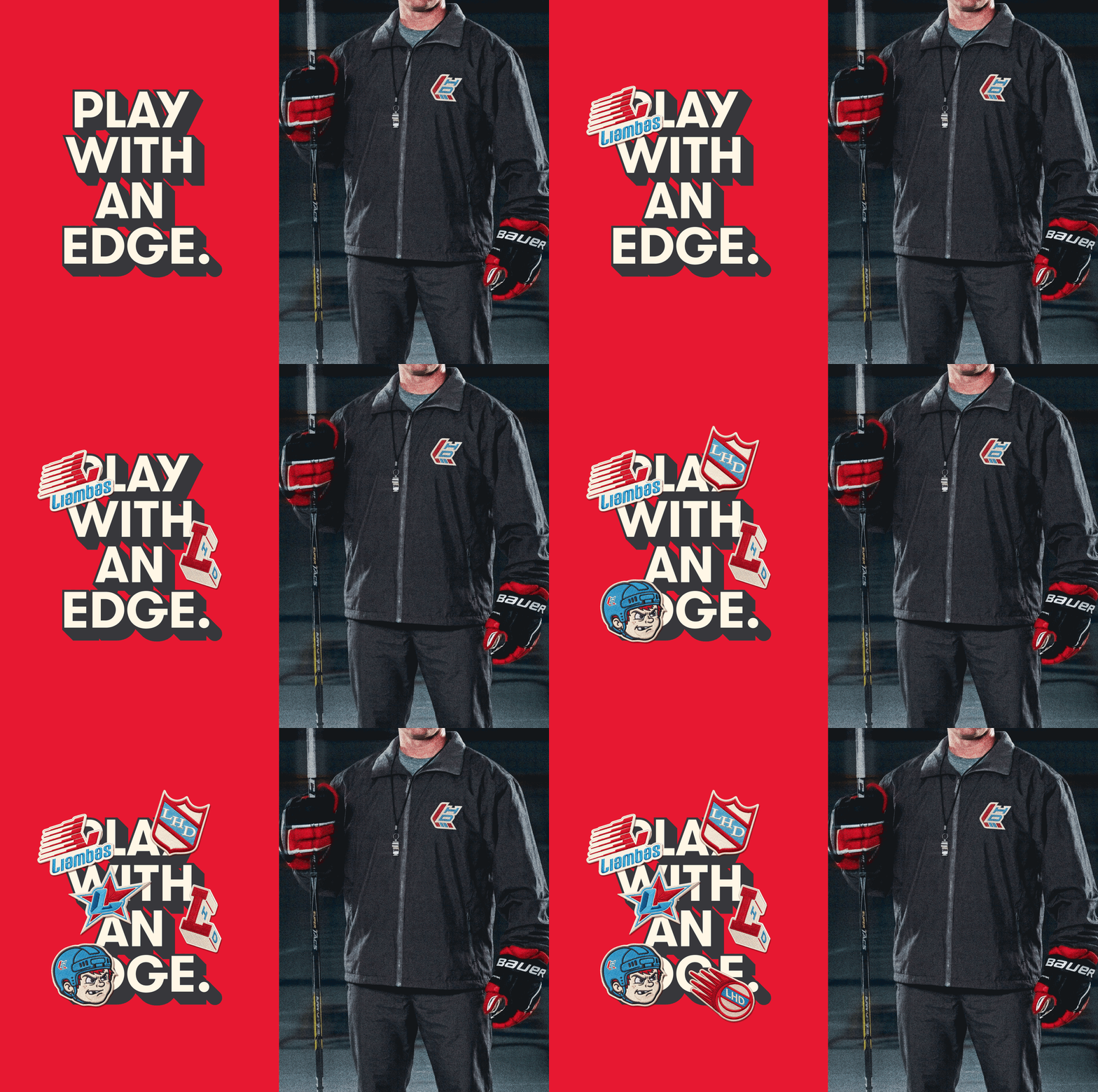
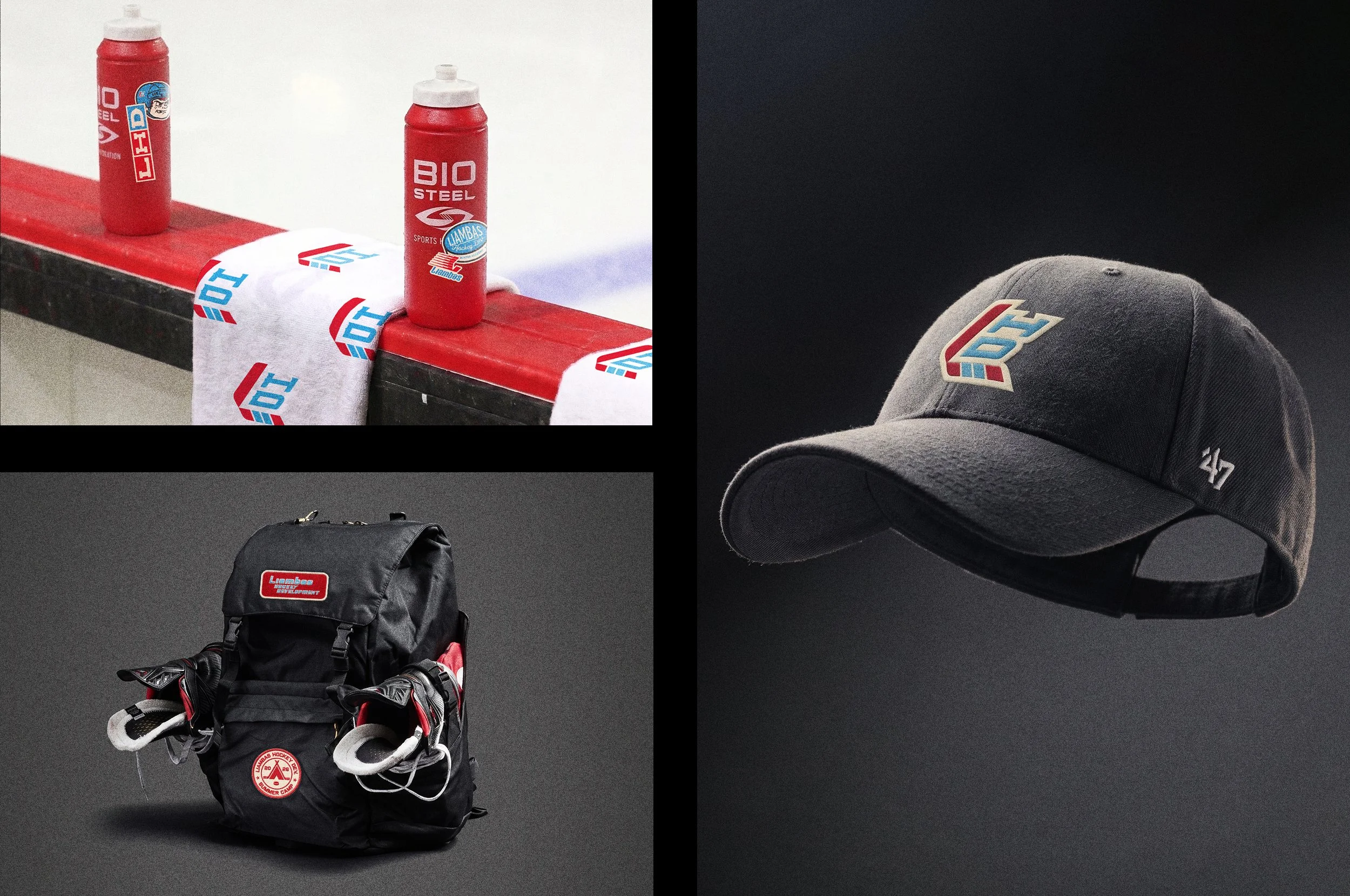
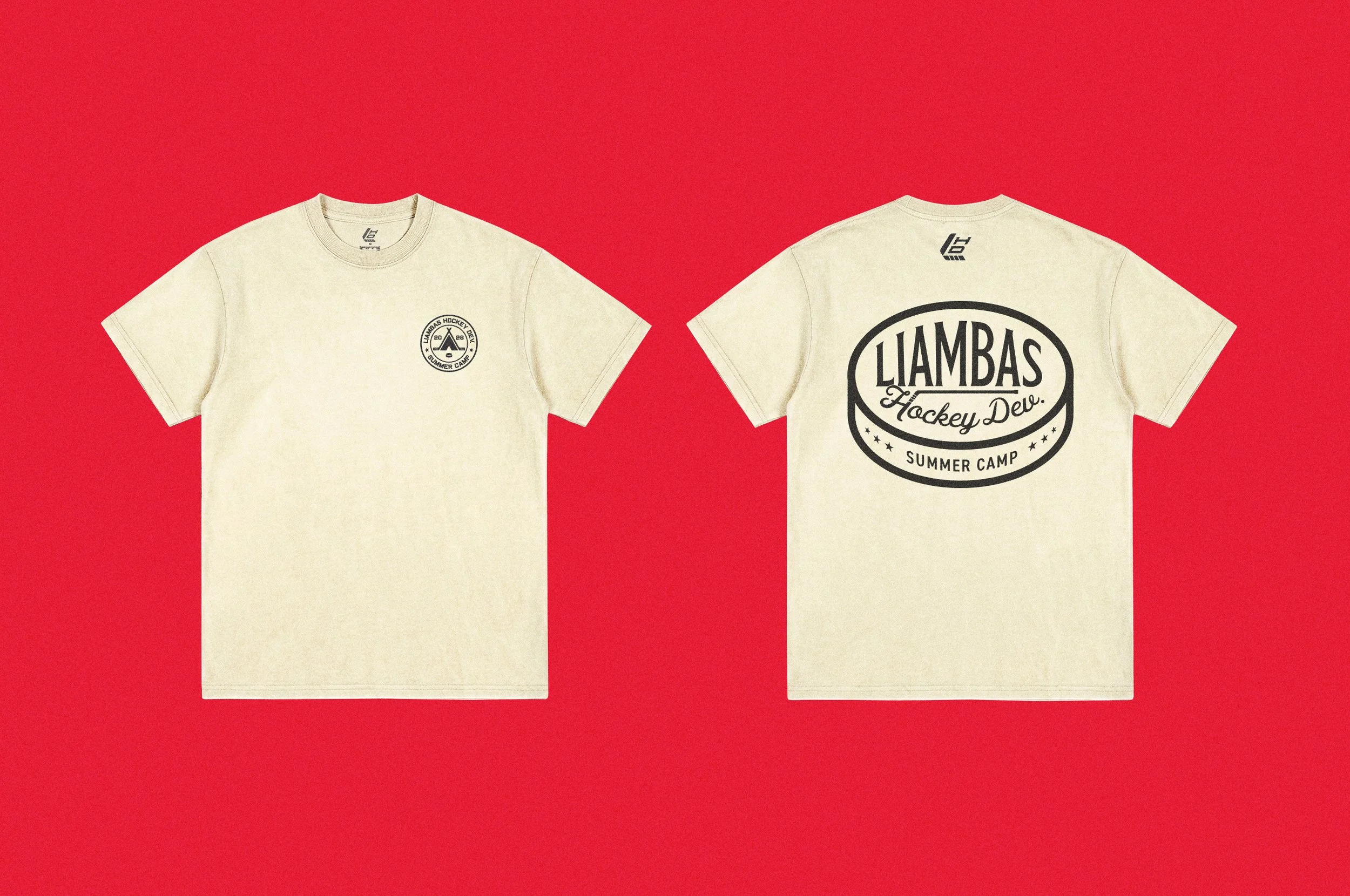
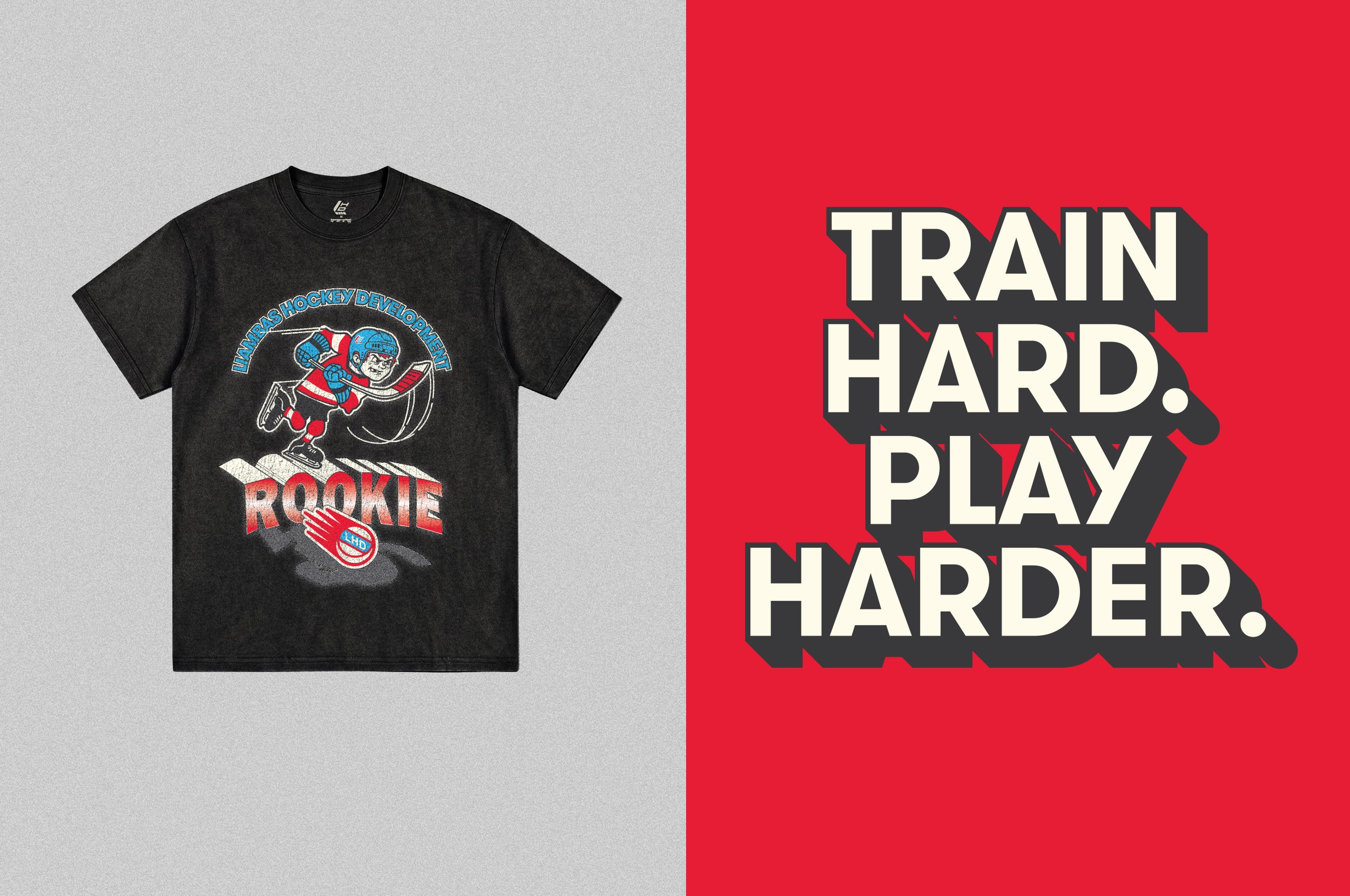
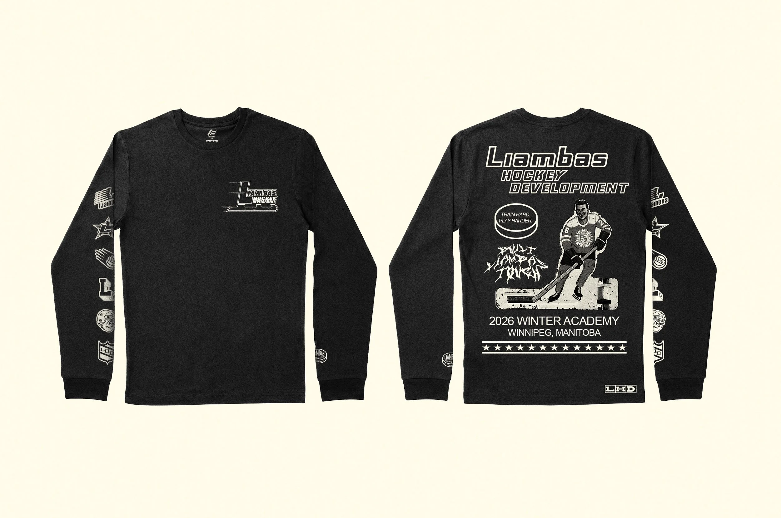
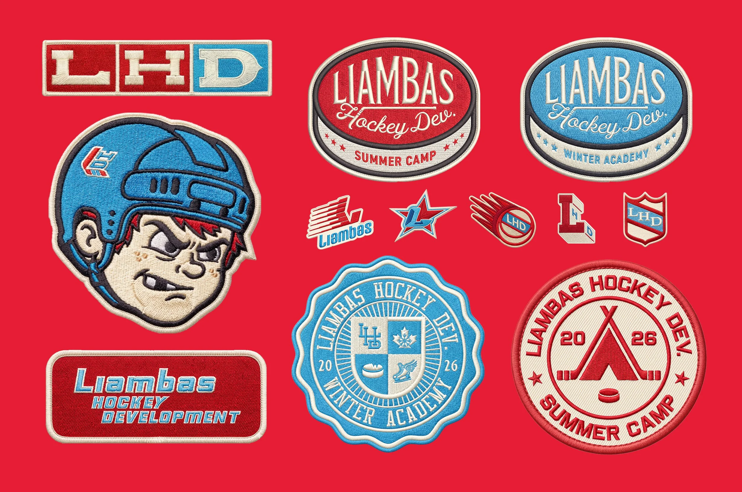
The visual direction looked to the era that gave hockey its loudest visual voice. The 90s NHL expansion era was a masterclass in graphic confidence, built on bold outlines, heavy contrast, and a willingness to be confrontational on the page. That energy informed how this system was constructed. We pulled from vintage t-shirts, early Nike hockey ads, and the kind of illustrative icons that used to live screen-printed on a bag or embroidered on a chest.
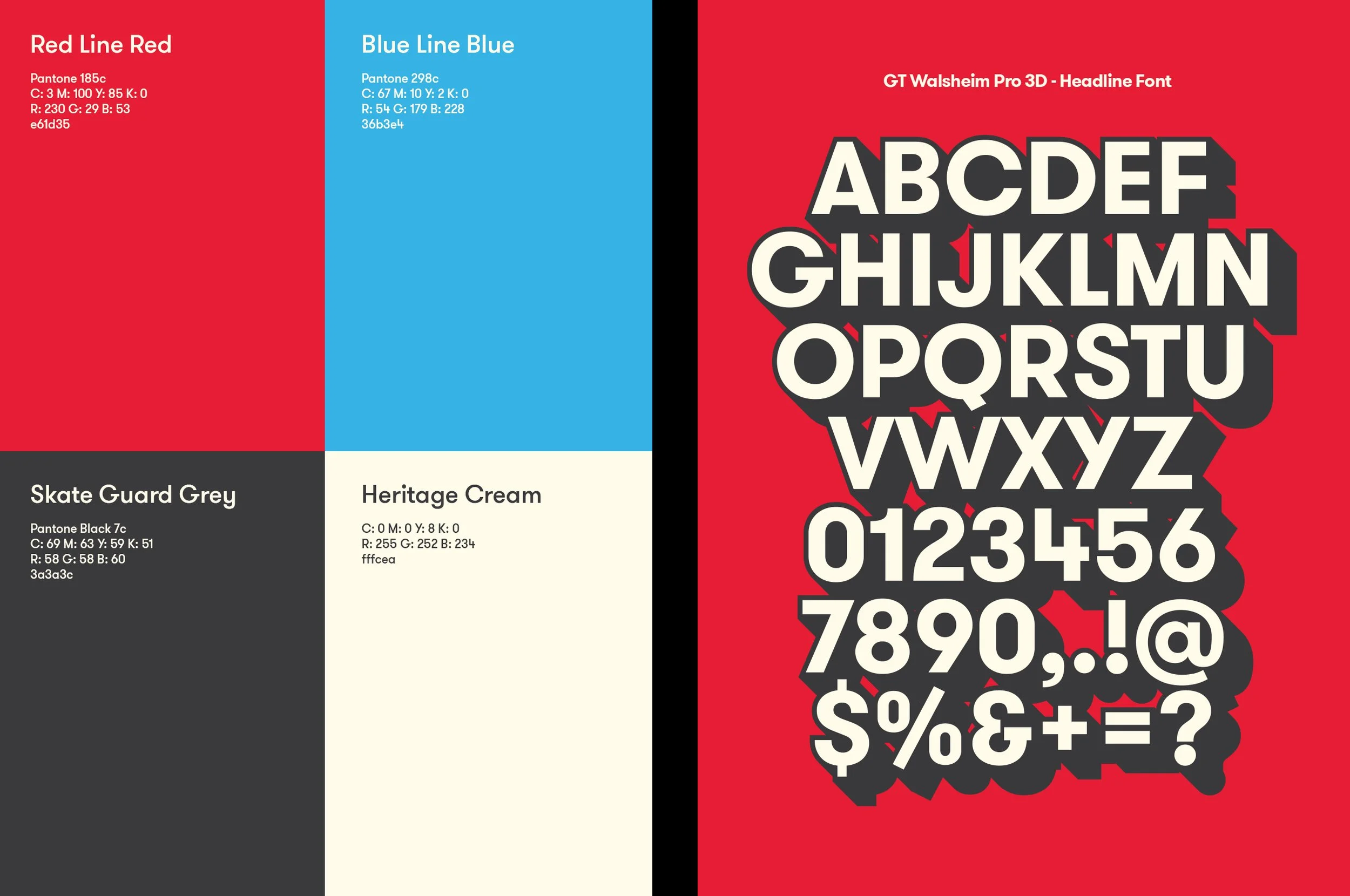
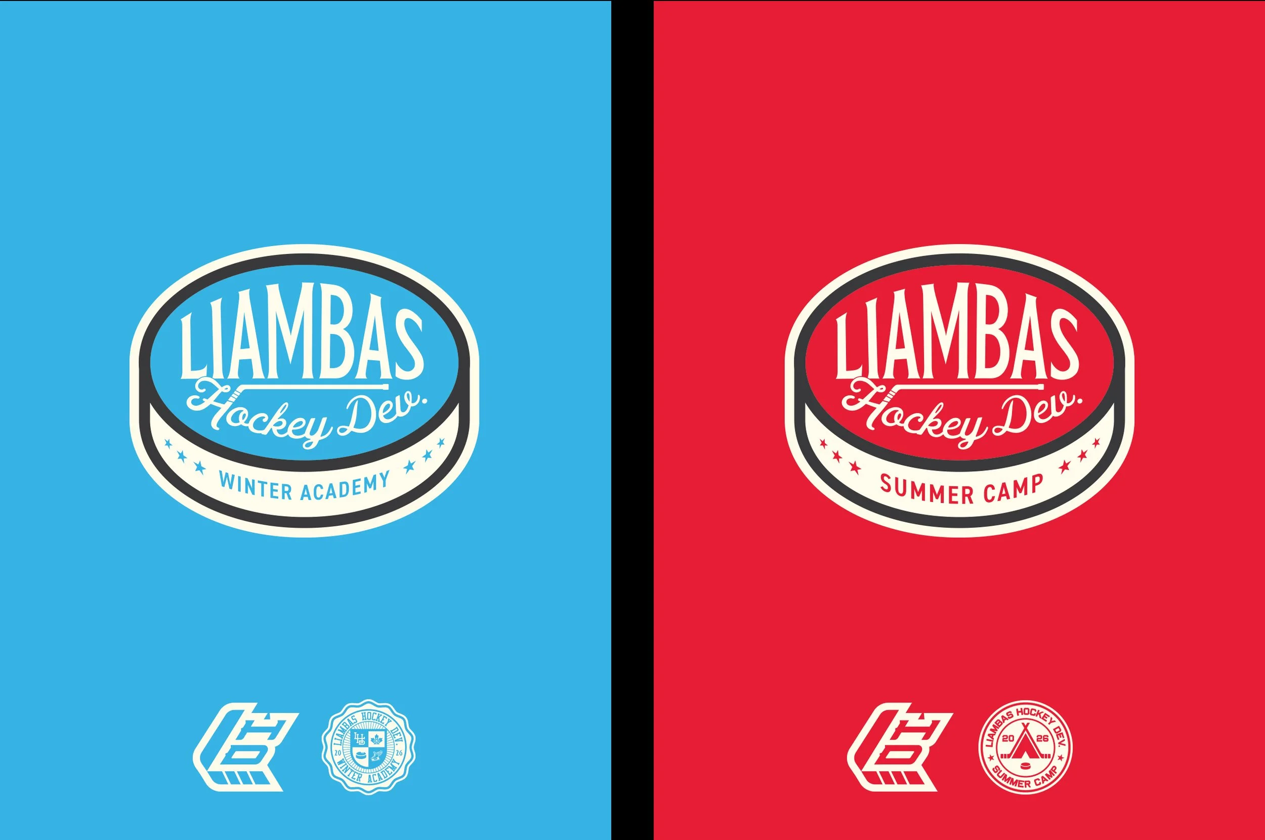
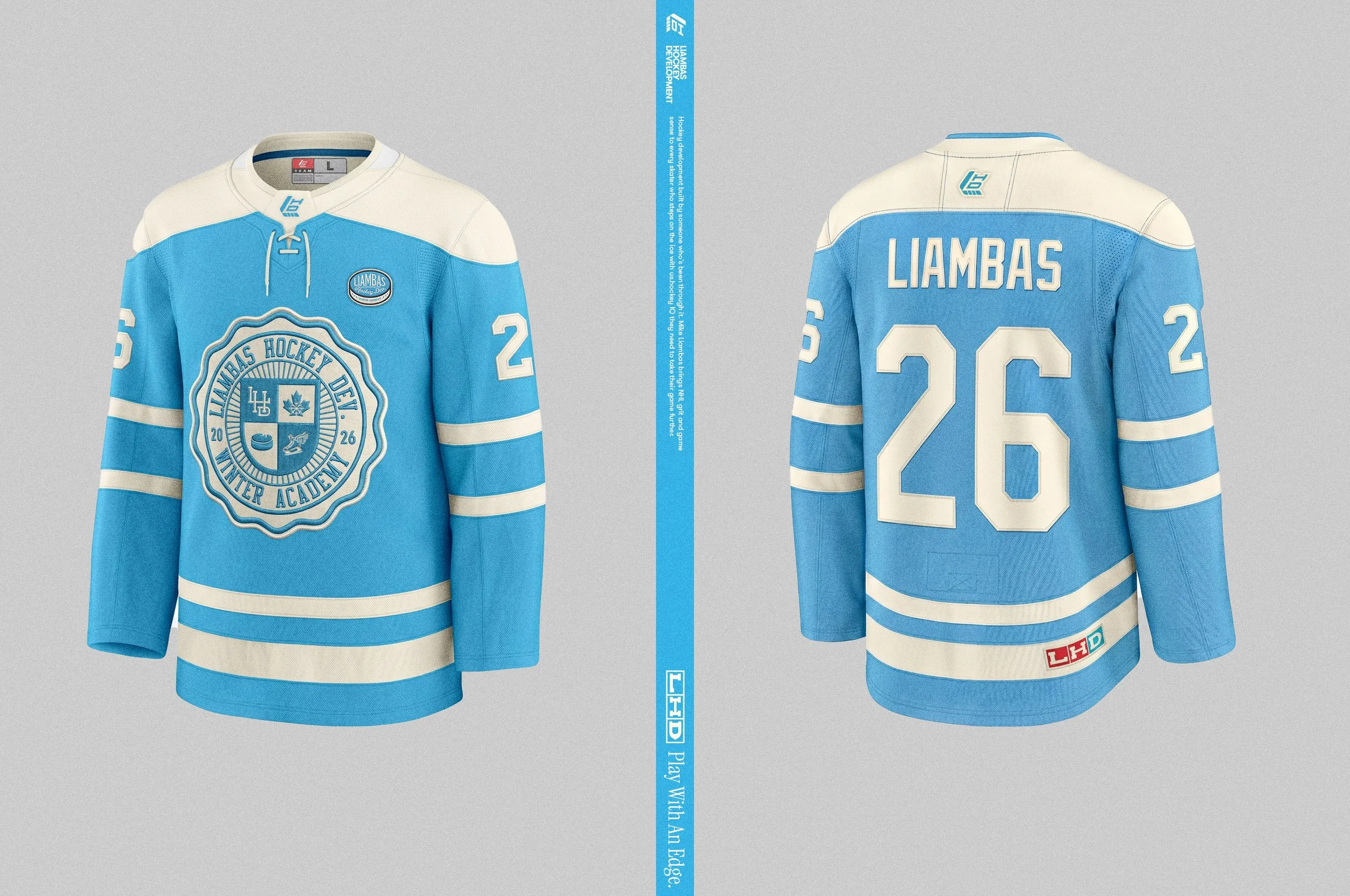
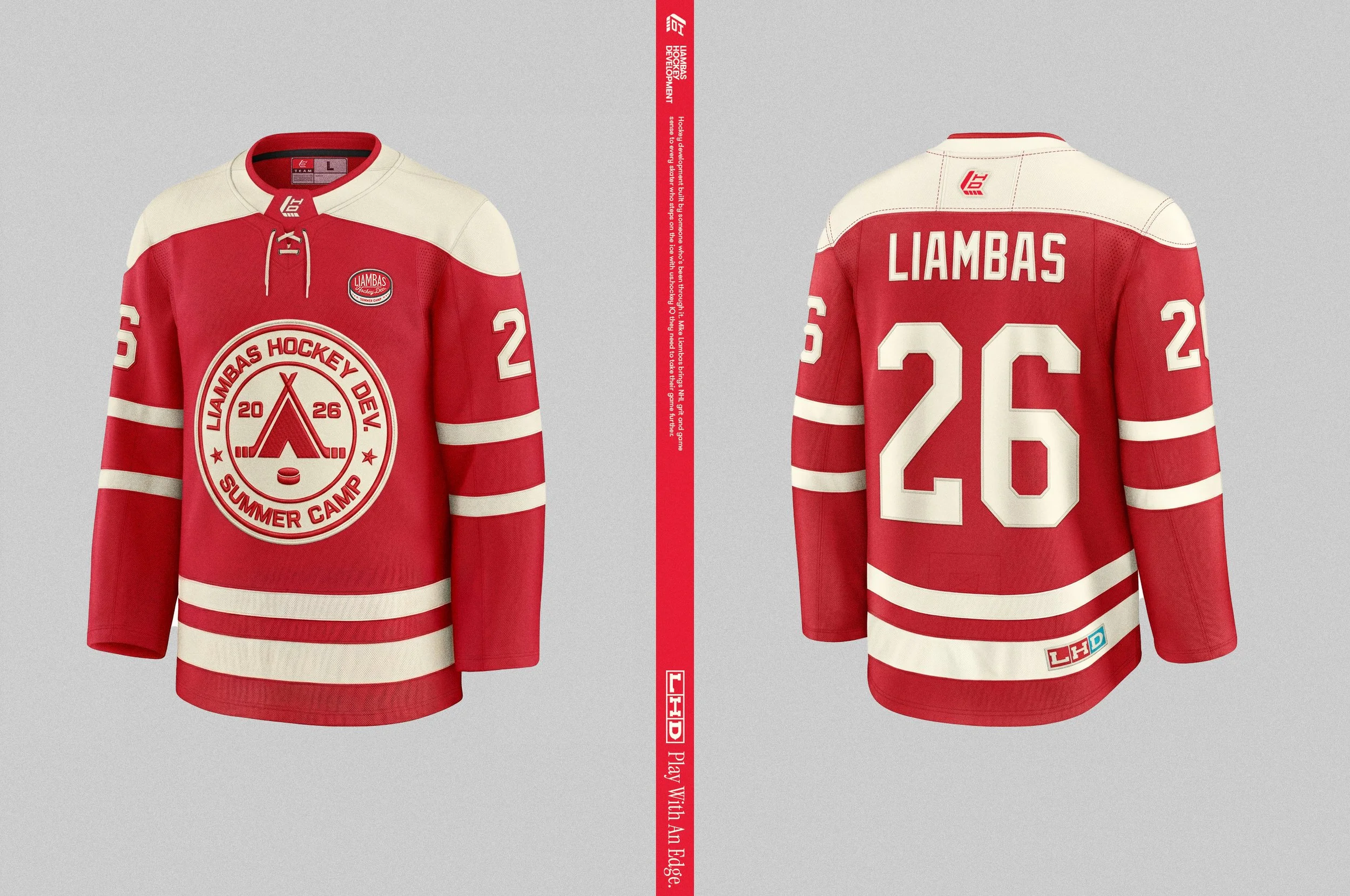
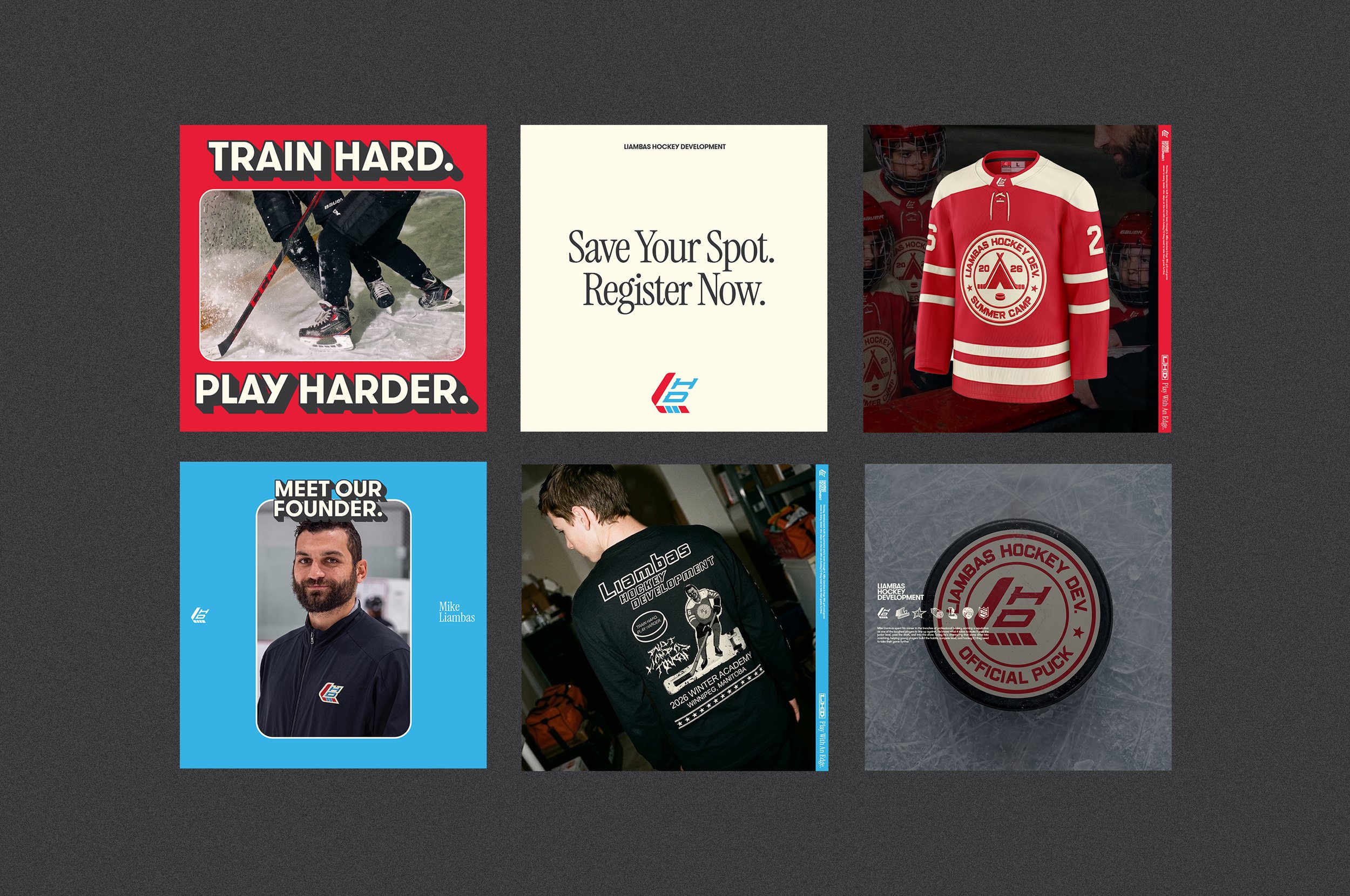
The colour system came straight from the ice. Blue and red lines, the Canada vs. USA rivalry, cream for heritage, grey as the workhorse. Every colour has a reason to be there.
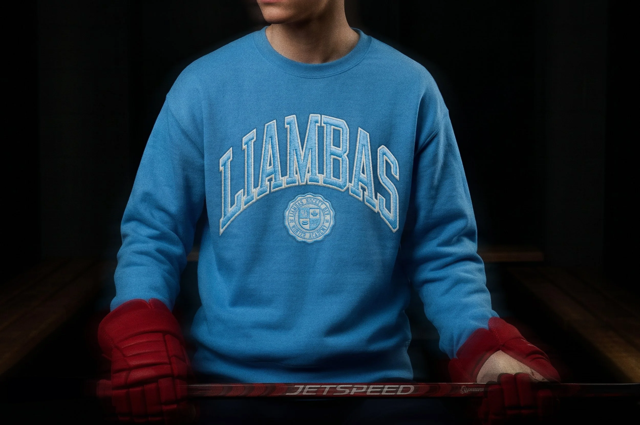
The program splits into Summer Camp and Winter Academy, each with its own jersey and badge. The kind you'd stitch on a bag and never take off. The kind you'd wear on a crewneck and feel proud about. A badge is a commitment. A crest is a credential.
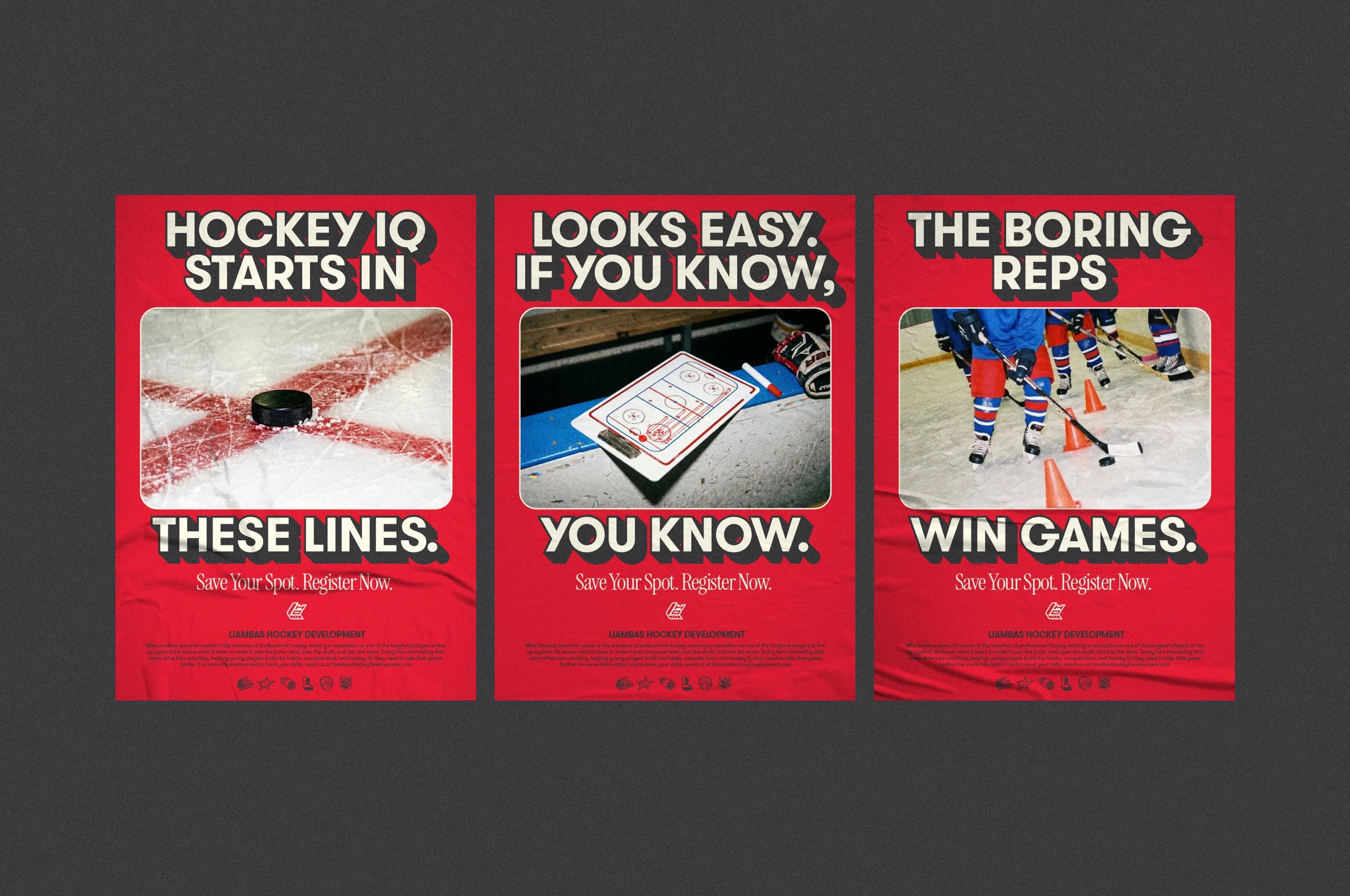
Photography, illustration, copy all held to the same standard. No filler, nothing safe, just like when you were up against Mike on the ice.
Featured on Beautiful Branding
Deliverables
Brand Identity
Sector
Sport & Culture