Eastbridge Partners
Eastbridge Partners has spent nearly two decades doing something rare in real estate development: staying in the room for the whole thing. Not just the pitch. Not just the ribbon cutting. The entire arc, from site feasibility to final delivery. That commitment needed a visual identity that reflected the same discipline. No noise. No posturing. Just clarity, confidence, and craft.
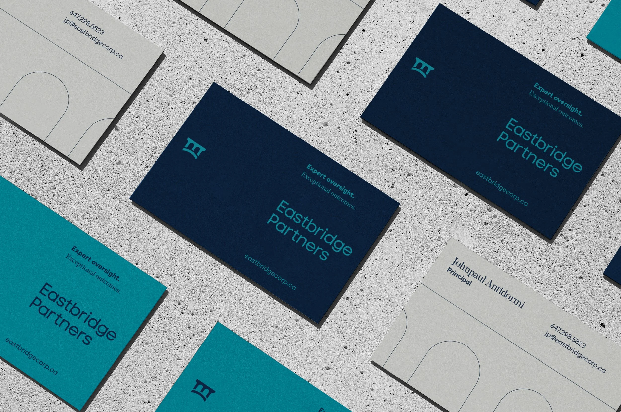
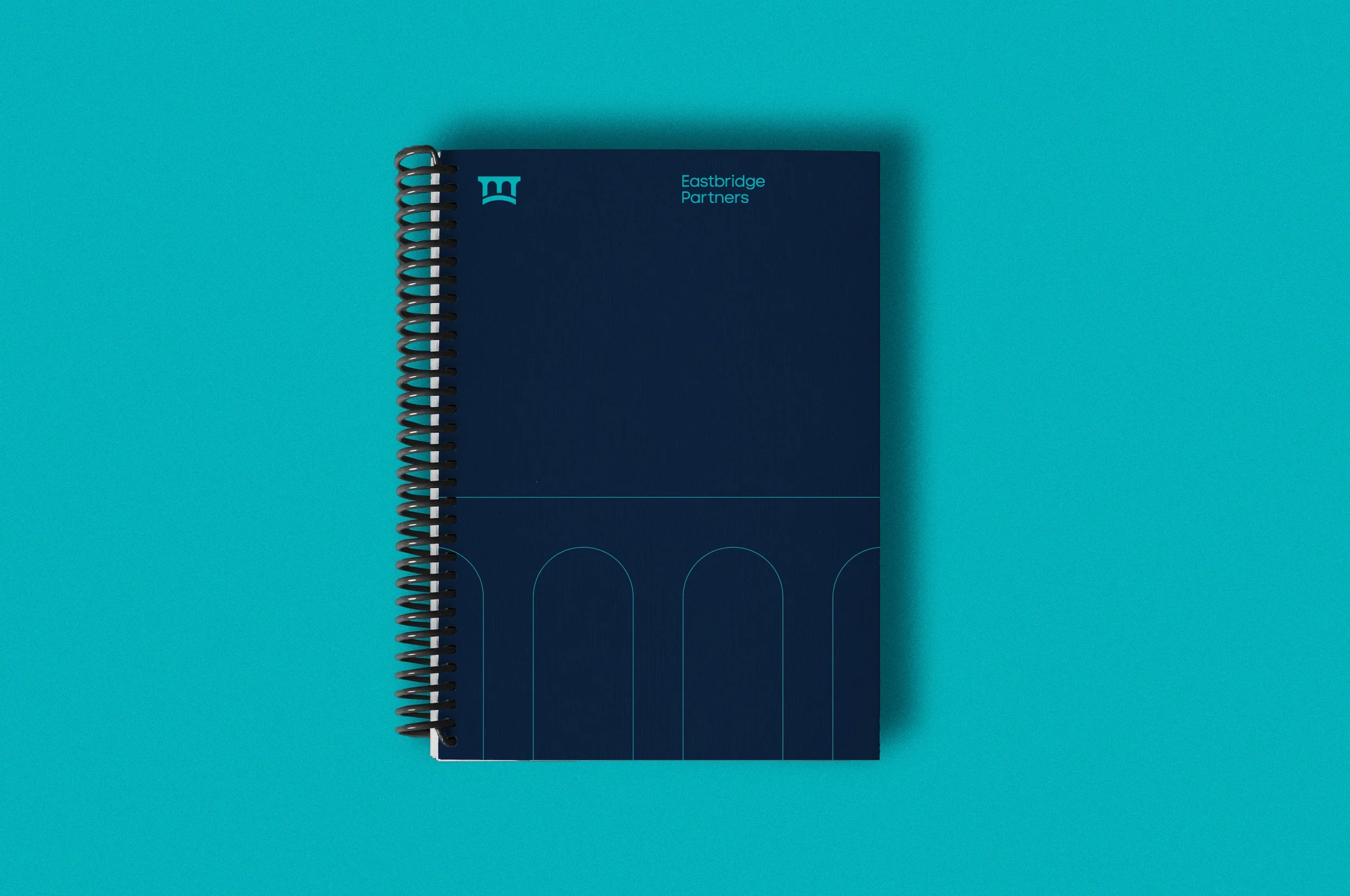
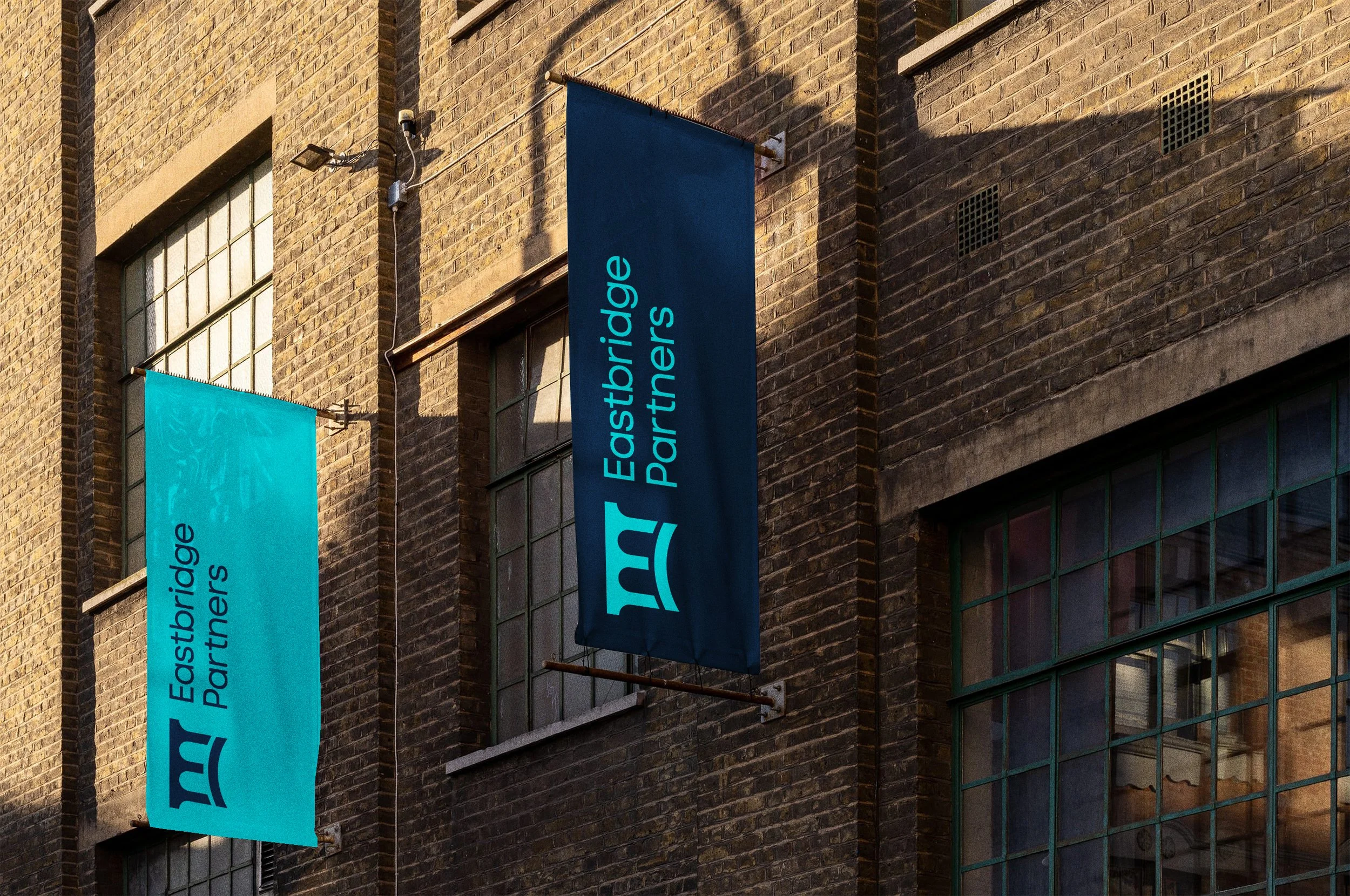
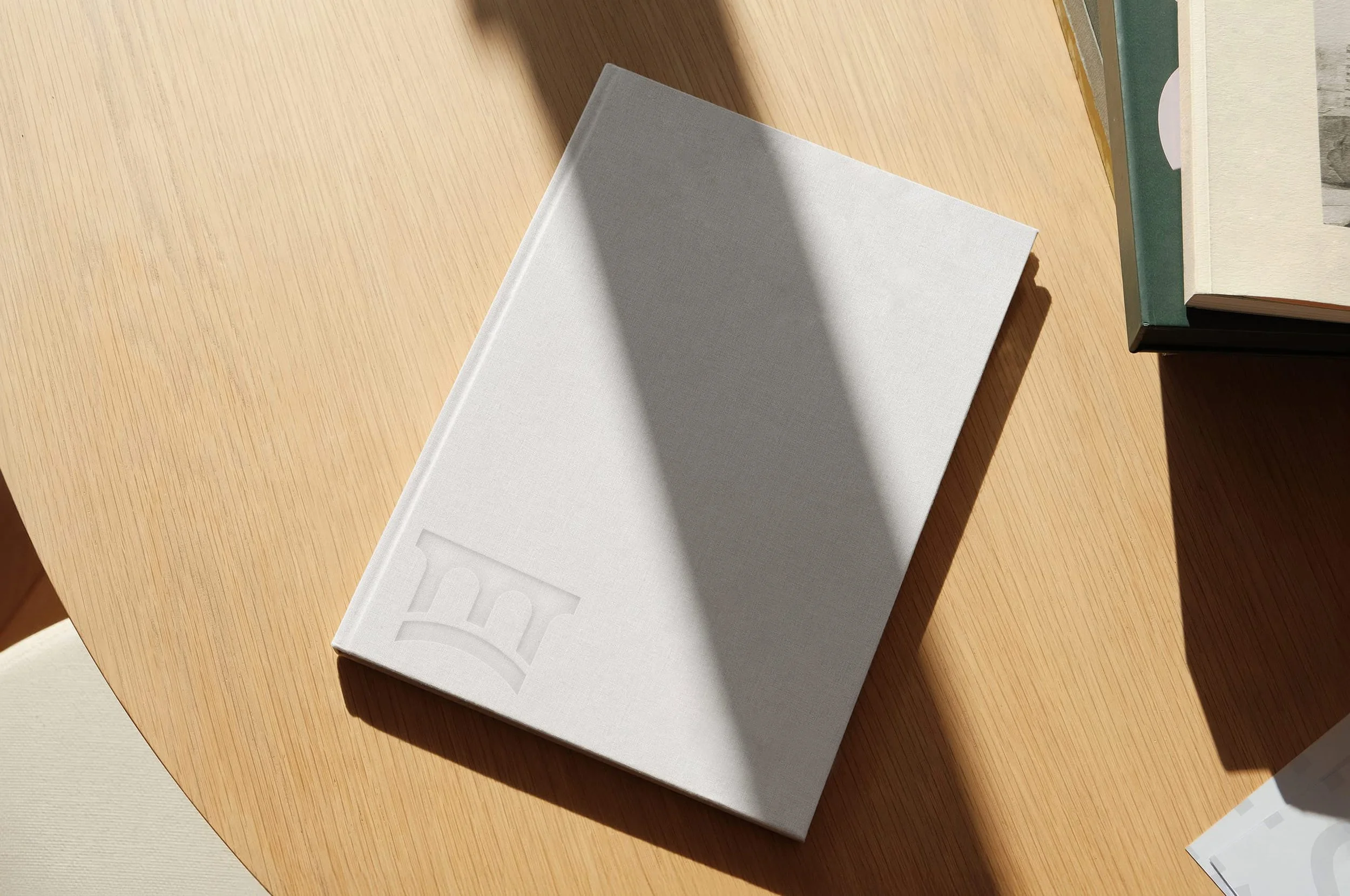
The logomark begins with a simple observation. The capital letter "E," rotated 90 degrees, becomes a bridge. Structurally sound. Elegant without trying. The form does exactly what Eastbridge does, it connects two points and holds the weight of everything in between. Beneath the span, a single base line runs from origin to end, representing the full journey of a project and the owner's mindset Eastbridge brings to every engagement. From first decision to final delivery, they're there.
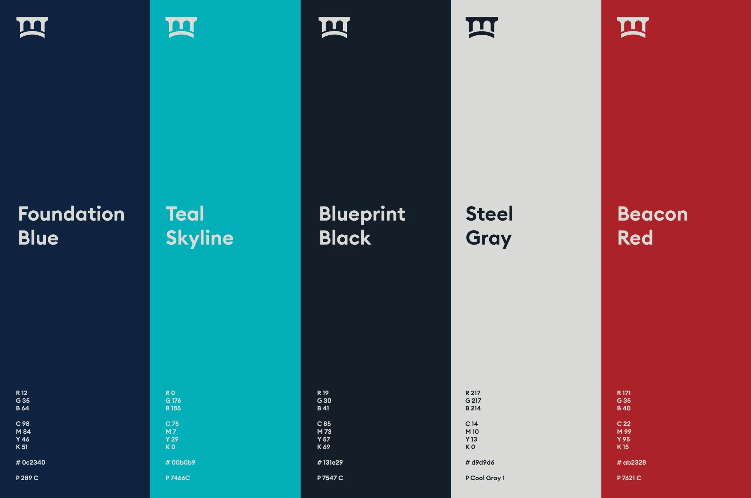
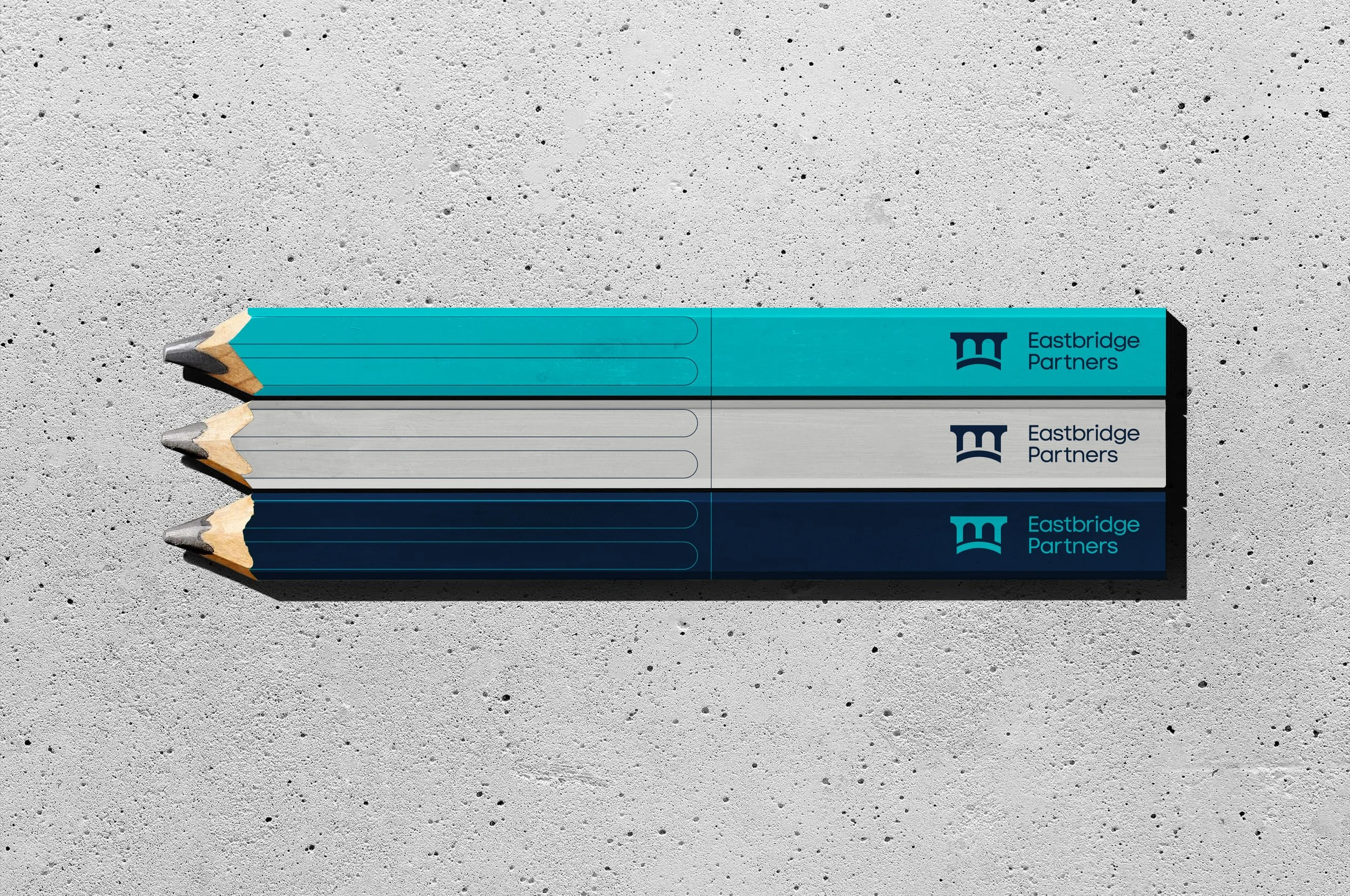
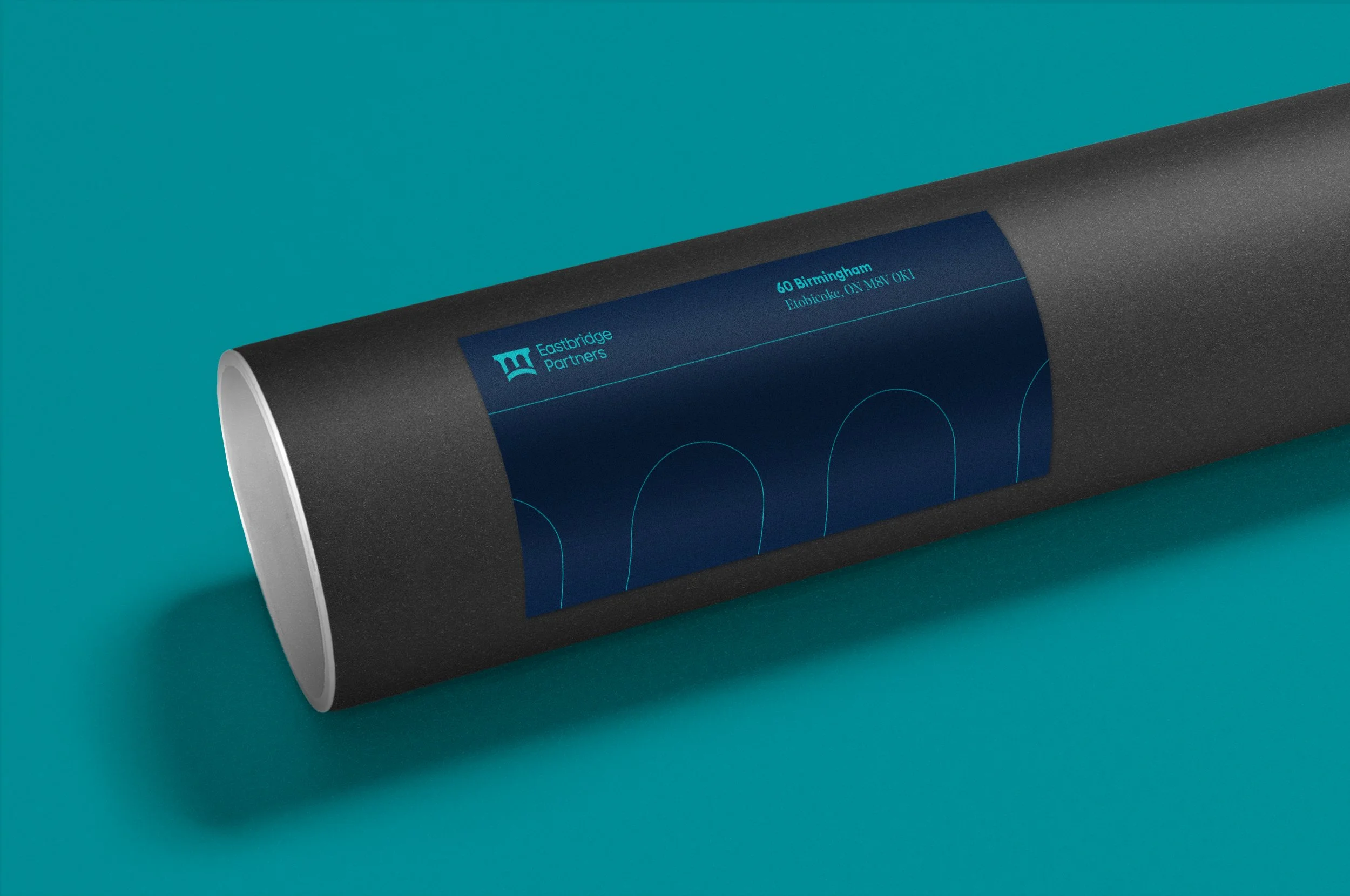
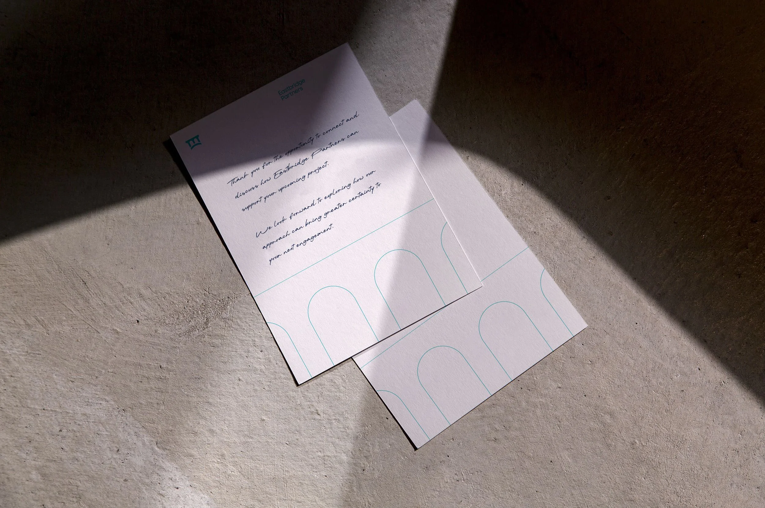
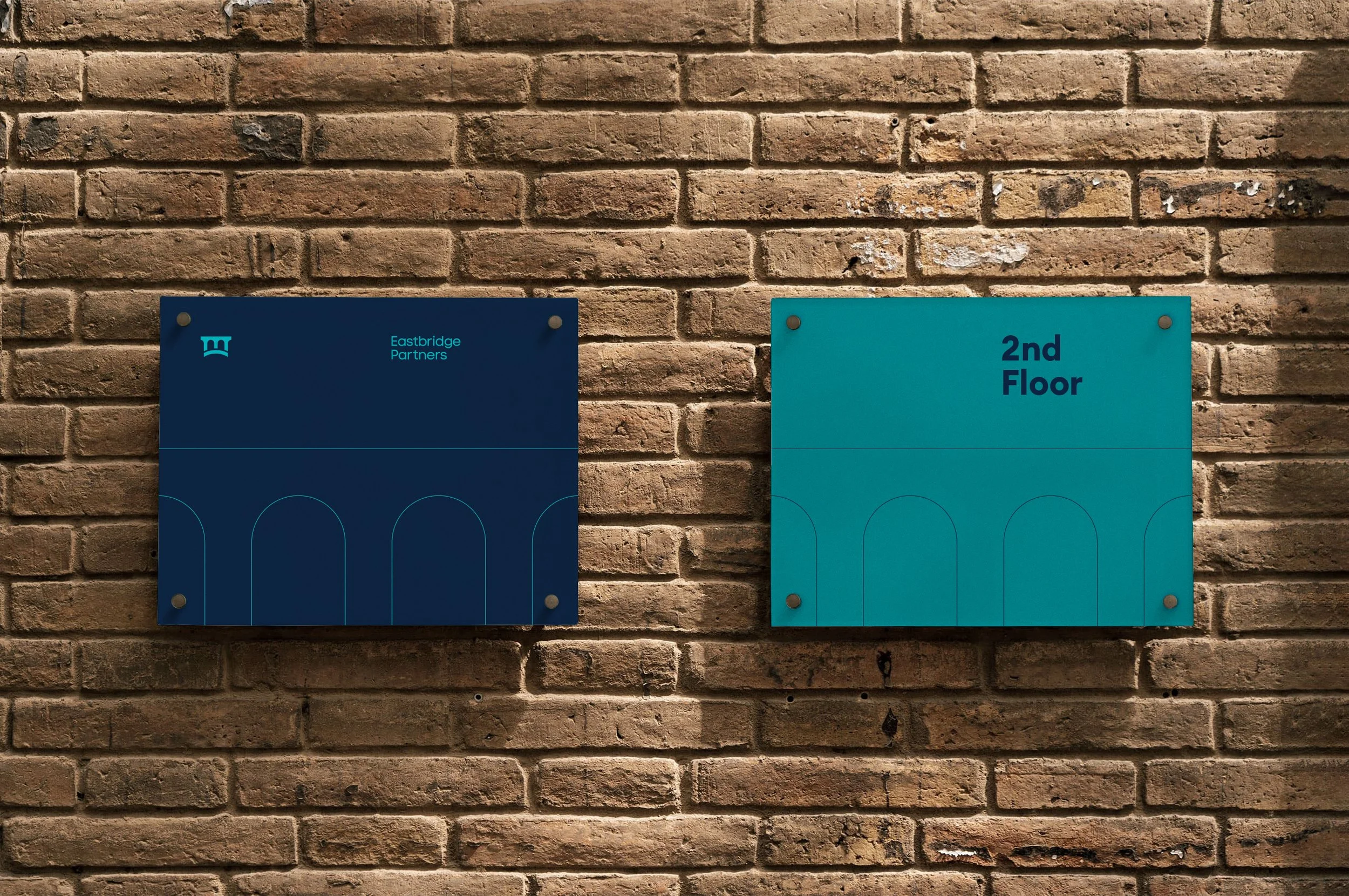
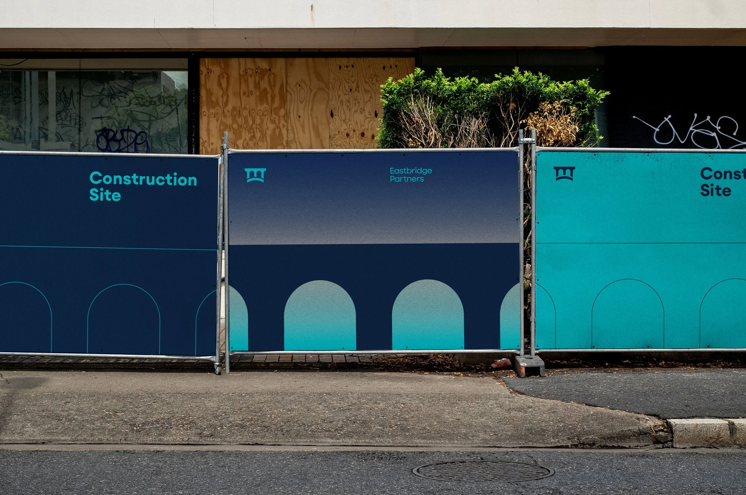
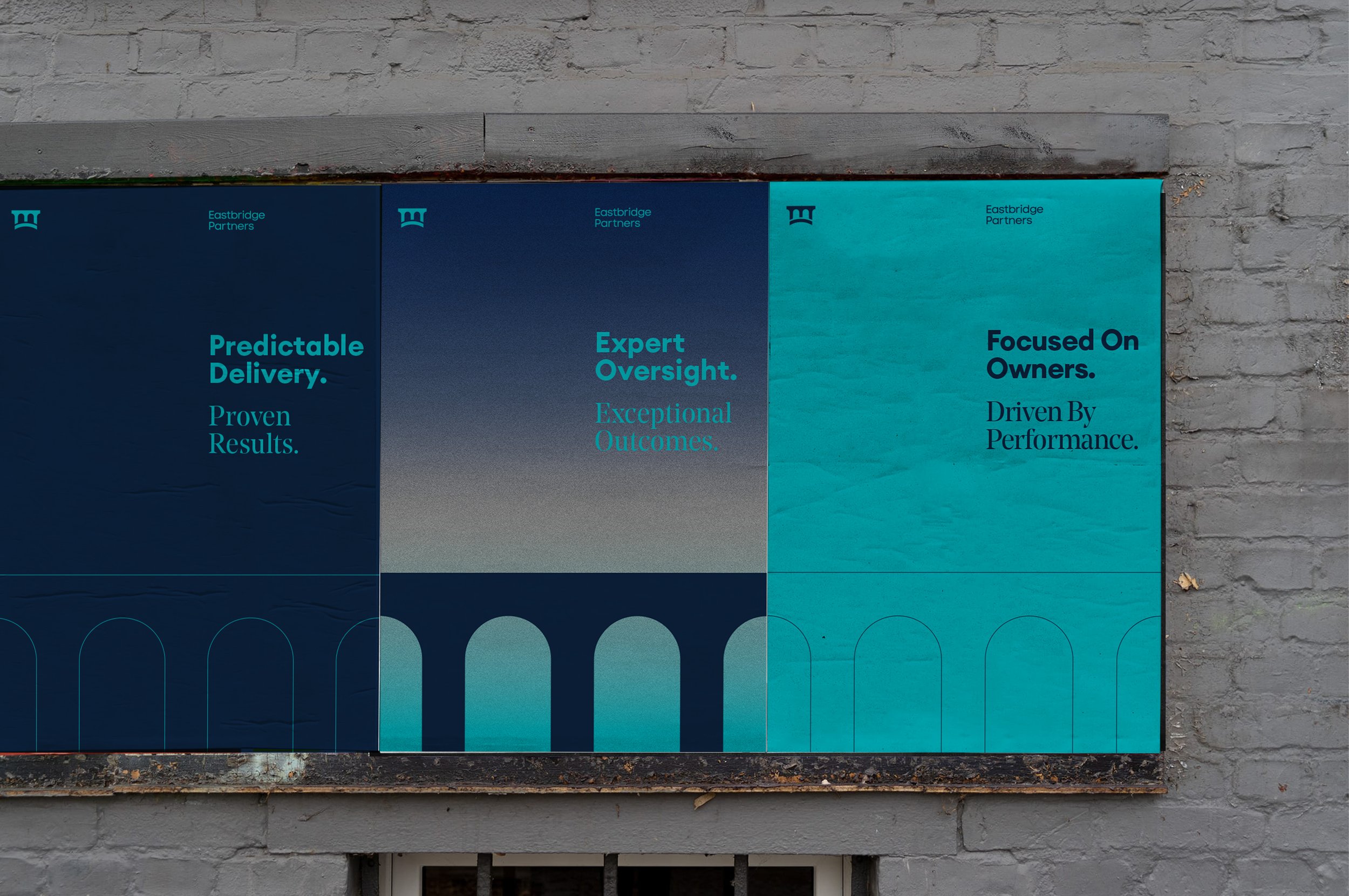
The colour palette draws from the materials and language of the built environment. These aren't borrowed aesthetics, they're the actual vocabulary of the industry, brought forward with intention. The result is a palette that reads as authoritative without being cold.
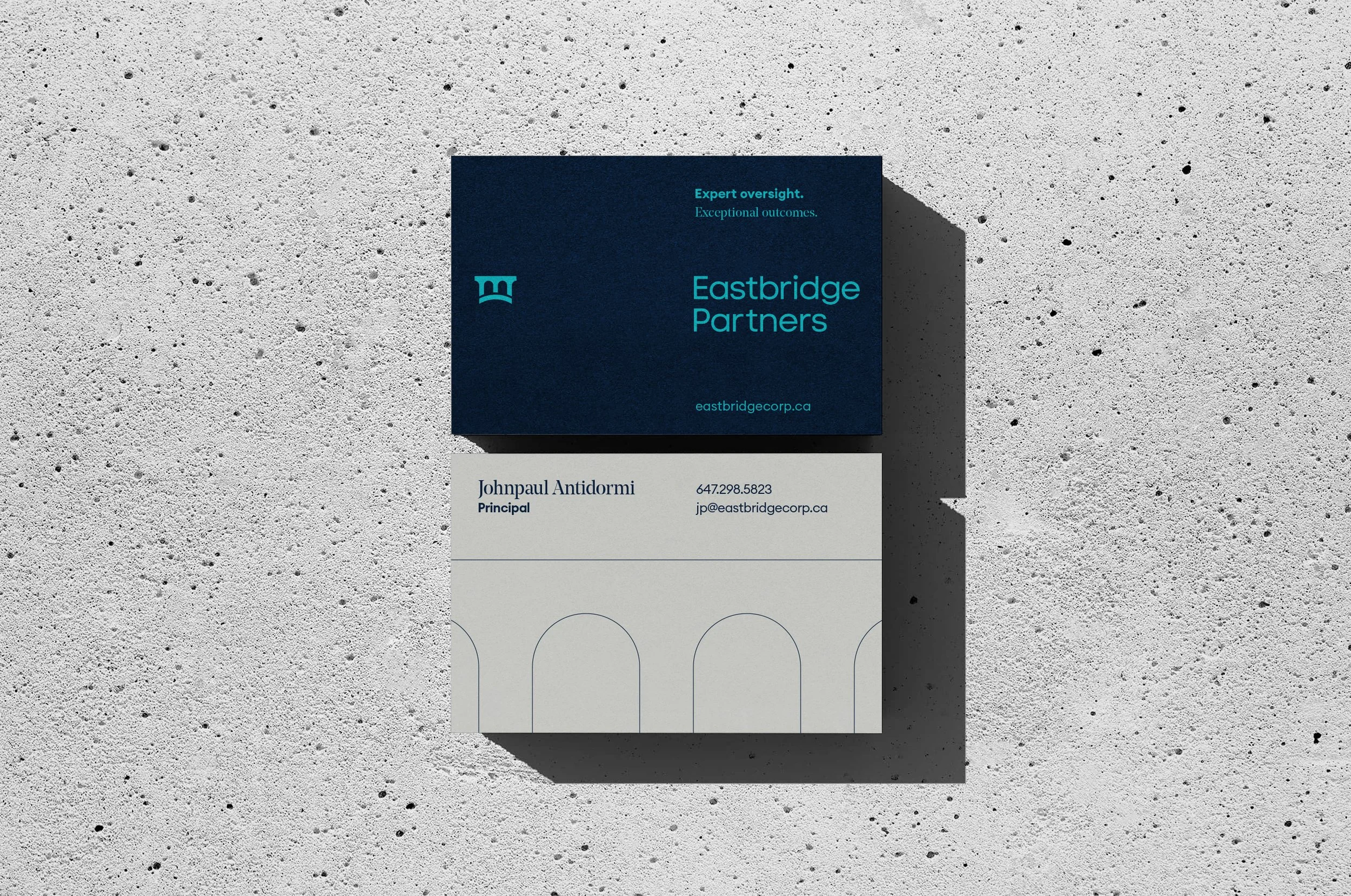
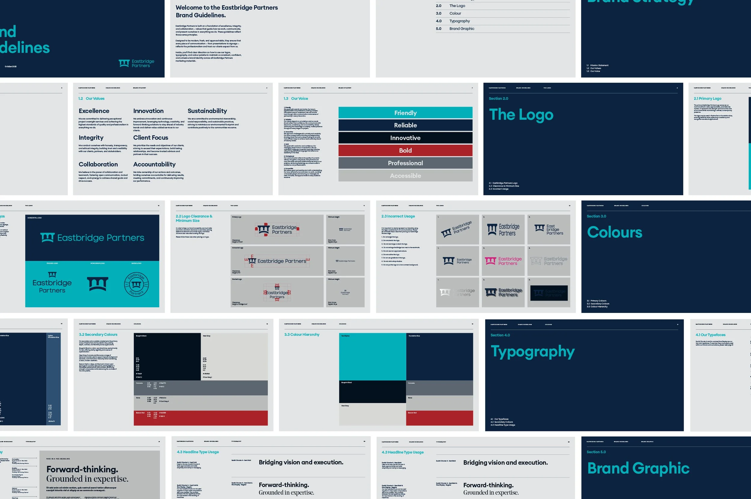
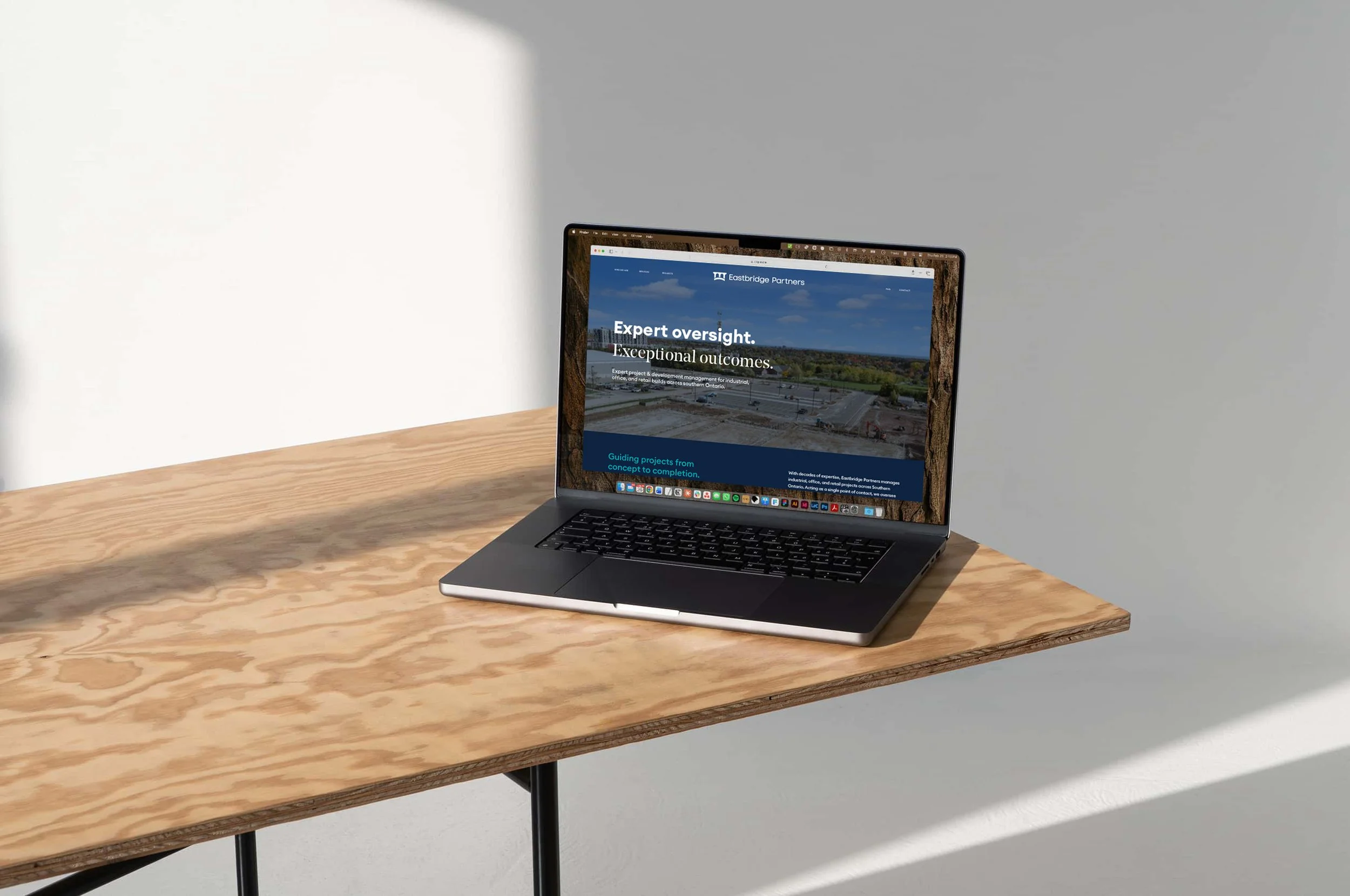
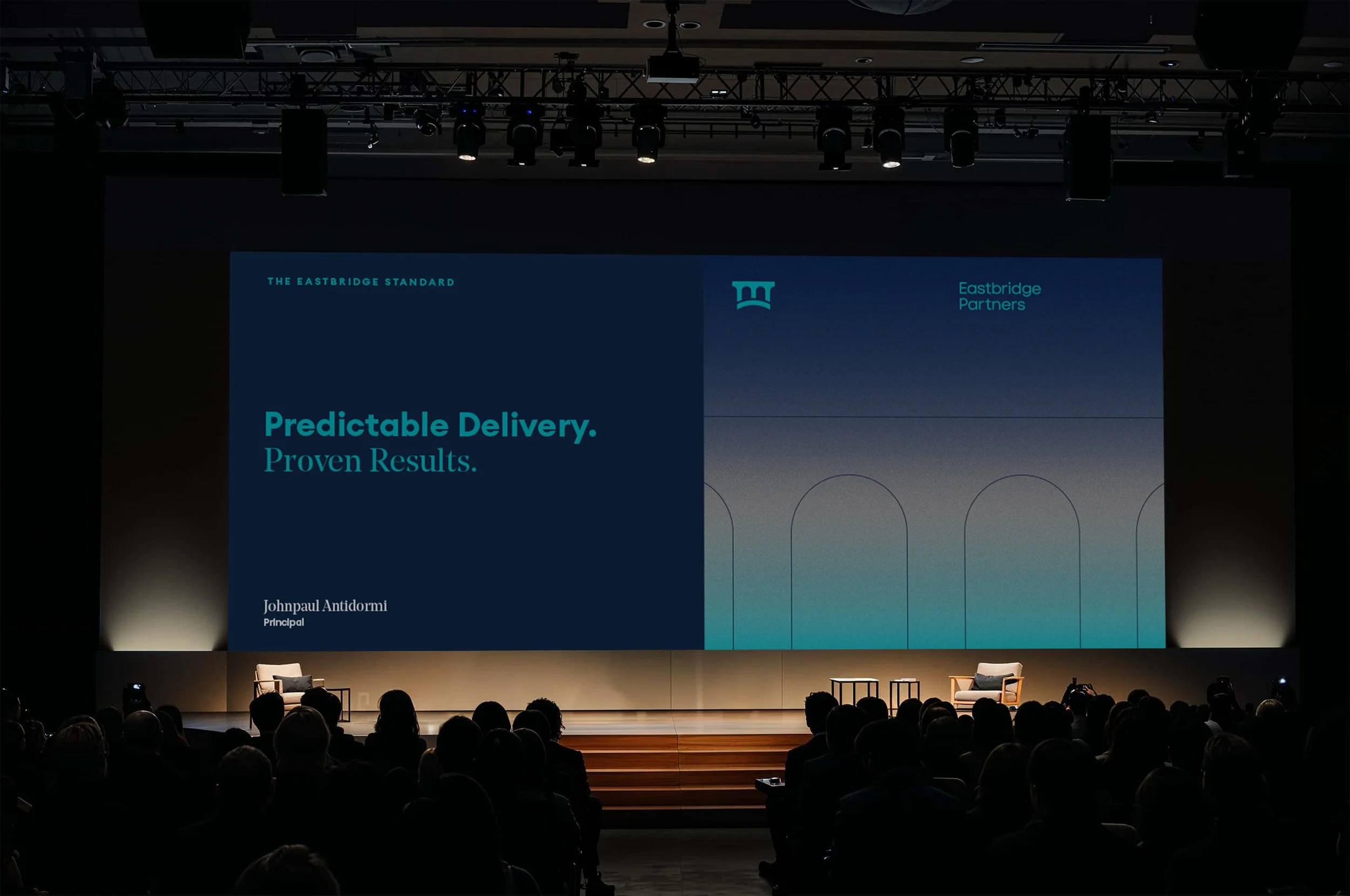
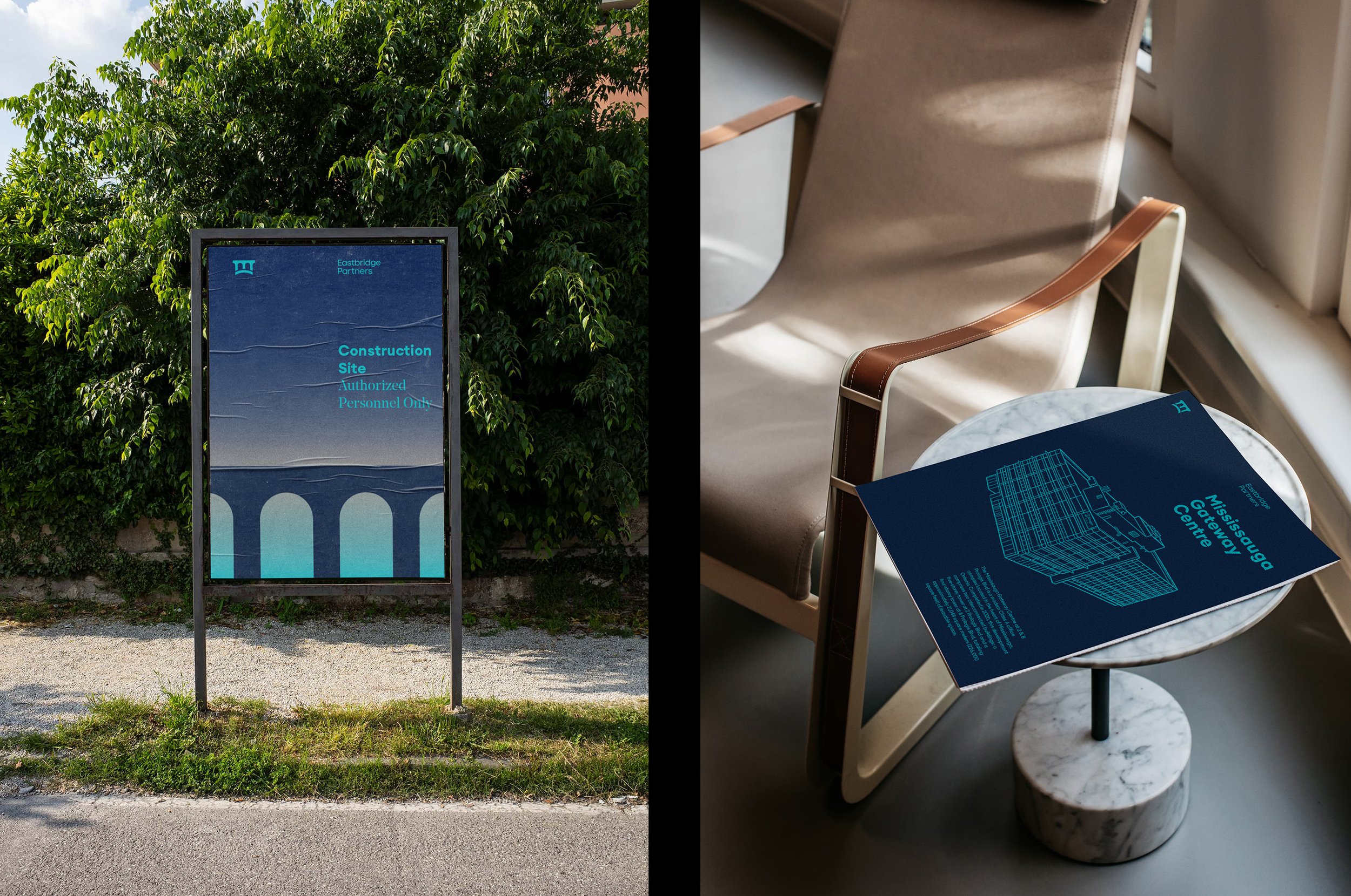
Typography pairs Euclid, a precise and modern sans serif, with Noe Display, a serif with weight and personality. Together they carry the two sides of Eastbridge: the analytical rigour of a seasoned project manager and the considered presence of a trusted advisor. Neither font dominates. They work in tandem, the way a good partnership should.
The system is built for a firm that operates without waste. Every element earns its place
Deliverables
Brand Identity
Sector
Project Development